Climate change performance of the United States 2000-2013 (and the new emission target)
2014
Last week the United States ‘agreed’ with China to reduce US greenhouse gas emissions between 26% and 28% from the 2005-level by 2025. The agreement is legally non-binding and without the support of the Republicans. The following analyze the new US emission target (in the bottom) and the general performance in comparison with the spying buddies in Five Eyes Alliance¹: Canada, Australia, New Zealand and United Kingdom.
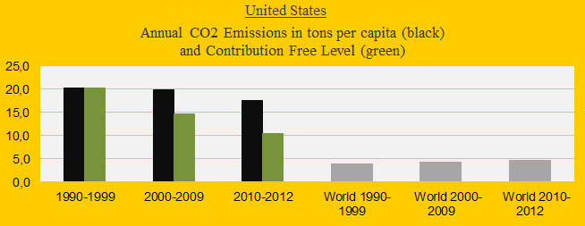
The United States is presently ranked 10th out of 147 countries in Climate Contribution (climate debt) per capita. See the ‘ranking’. The US ‘share of the global Climate Contributions’ is now 37.0%, compared to 40.7% in 2010. The first diagram shows the CO2 Emissions per capita in decades in comparison with the world average. The green bars are the Contribution Free Level, determined by the level of CO2 Emissions in the 1990s and the eleven ‘indicators’. The declining US share of the global climate debt is mainly due to reduced CO2 Emissions while the global emissions have increased.
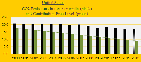
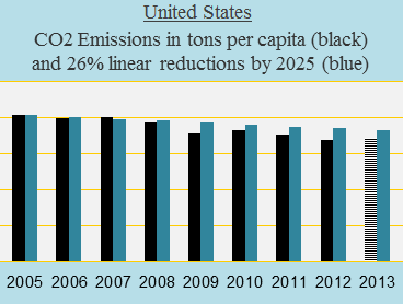
The diagram below shows the US CO2 Emissions per capita since the millennium. The 2013-emissions are preliminary estimates. The two first diagrams together reveal that US emissions remained unchanged at around 20 tons per capita during the period 1990-2007. Under the Obama administration (and after the financial crisis in 2008) emissions per capita have decreased by around 14%, or in other words: 2013-emissions were 14% below the level in the 1990s. The corresponding reductions of the other countries in Five Eyes Alliance are: United Kingdom 23%, Canada 6%, New Zealand +1% and Australia +11%. The latter two have increased emissions since the 1990s.
Overall, the United States, Canada, Australia, New Zealand and United Kingdom (with 6% of the global population in 2012) have emitted 28% of the global CO2 Emissions from fossil fuels since 1960. The reason for the Five Eyes Alliance’s illegal spying of other countries’ delegations during the global climate negotiations (COP summits) obviously were to ensure that factual discussions of historical climate debt were derailed. Note that the impact on climate from carbon dioxide from the burning of fossil fuels has been known since the 1960s or even earlier (read ‘History of global warming‘). It is also clear that accumulated national wealth is founded on free CO2 Emissions many decades back.
The calculation of national Climate Contributions (climate debt) in ClimatePositions ignores CO2 Emissions from fossil fuels prior to 2000. On the other hand, a country’s wealth determines the size of the Climate Contribution if the CO2 Emissions are not reduced sufficiently after 2000. Read about the calculation methods ‘here’.
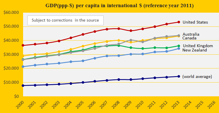
The diagram below illustrates the accumulated wealth (GDP(ppp-$) per capita) of the five countries, in comparison with the world average. Part of the accumulated wealth is regarded as climate debt and ClimatePositions continuously calculate the size of this debt (see the menu “Contributions”).
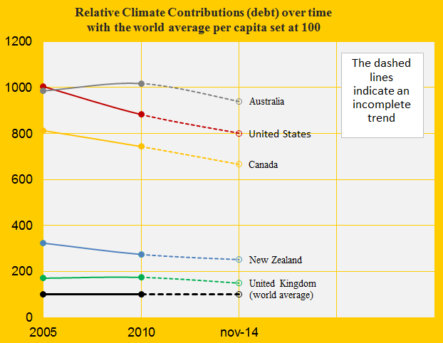
The Climate Contributions can be expressed in different ways. In the diagram below the world average Climate Contribution per capita is set at 100. The contribution per capita of all five countries is larger than the world average. However, the global contribution grows even faster than the one of the five countries.
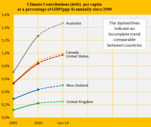
Economic growth while reducing the climate debt is a noble and usually unrealistic goal. The diagram below shows the climate debt as a percentage of GDP(ppp-$) annually since the start in 2000 (year zero in ClimatePositions). The economic growth of Australia is extremely linked to irresponsibility towards climate and future life on the planet. United Kingdom stands out positively among these five countries. See the ‘ranking’.
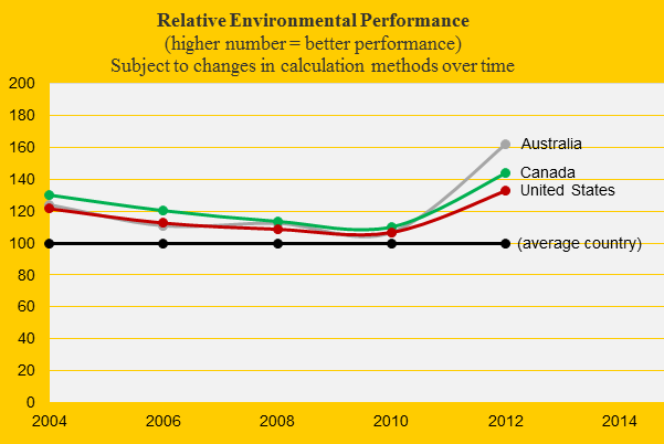
The updated Environmental Performance of the United States is poorest among the five countries. The diagram (below) shows the development over time in comparison with Canada and Australia (perform the best among the five).
Now back to the US-Chinese emission agreement: If the United States reduces the CO2 Emissions by 26% per capita by 2025 in comparison with the 2005-level, then the linear reduction looks like the blue bars in the diagram below. The black bars show the actual CO2 Emissions. What Obama apparently promised the Chinese leaders was that the only manifest CO2 reductions in the history of the United States (reductions in 2008-2013 mainly due to fracking instead of coal) were too much and too early!
.
¹Read about Five Eyes Alliance in ‘Guardian 2013’, ‘Guardian 2014’ and ‘Wikipedia’.
Information on national GDP(ppp-$) per capita: Worldbank (links in the menu “Calculations”).
Source on CO2 Emissions: EIA, U.S. Energy Information Administration (links in the menu “Calculations”).
Source on Environmental Performance: Yale and Columbia University reports, published 2006-2014 (links in the menu “Calculations”).
Comments are closed.