Climate performance: France versus Spain
2013
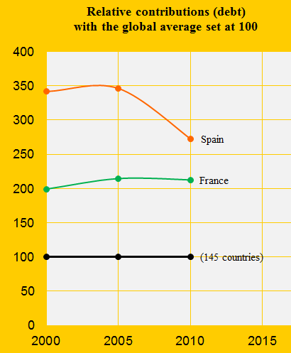
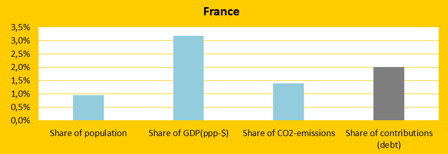
France was the 26th and Spain the 23rd worst performing country out of 145 in ClimatePositions 2010. As illustrated in the above diagram, the difference in the Contributions (climate debt) has narrowed between 2005 and 2010. Both countries have improved three rankings since 2005. See the full country list in the menu “Contributions/Per Capita US$ Rank”. The following examines the CO2 Emissions, forest area, GDP(ppp-$) and the world’s shares (Population, CO2 Emissions, GDP and Climate Contributions) of the two countries.
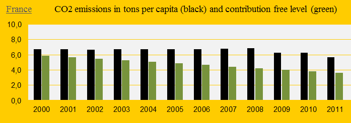
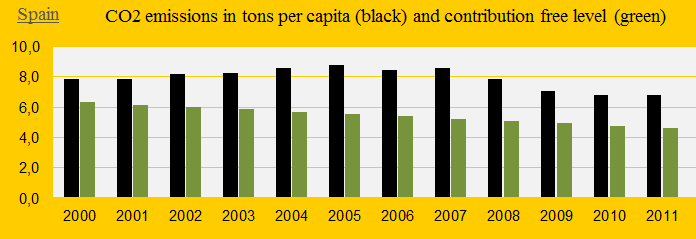
The two diagrams below show France’s and Spain’s annual CO2 Emissions per capita since 2000. The green bars are the Contribution Free Levels. The promising reductions the last 3-4 years appear a decade too late and are coincidences with the financial crisis.
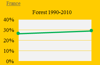
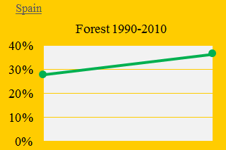
France has increased the total forest cover from 26.4% in 1990 to 29.0% in 2010 and the corresponding figures in Spain are impressive: from 27.7% to 36.4%. Had Spain not increased its forest cover since 1990, then the extra cost in Climate Contribution would have been $18 billion. The two diagrams below show the development of forest cover over the last three decades.
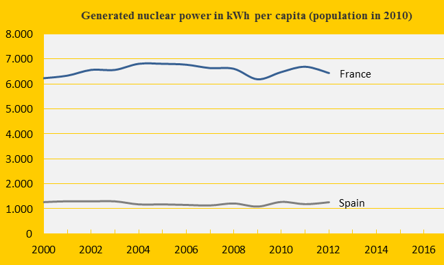
The Nuclear Power generation measured in kWh per capita has been stable for both countries since 2000, but France is ranked 2nd (after Sweden) and Spain 19th on the list of Nuclear Power generating countries per capita (see the diagram below). Had France reduced the Nuclear Power generation to the same level as Spain in 2000-2012, then the total Climate Contribution (climate debt) would have been $19 billion instead of $66 billion. The radioactive waste is left to future generations for thousands of years.
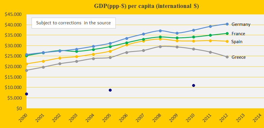
The diagram below shows the development in GDP(ppp-$) for France, Spain, Germany, Greece and the world average (the blue dots). The financial crisis struck the world in 2008.
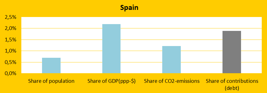
The last two diagrams (below) illustrate the climate change positions of France and Spain. The French Contribution is due to lack of reductions in CO2 Emissions and Nuclear Power in 2000-2010 compared to the high levels in the 1990s. The Spanish Contribution is even larger because of significantly increasing CO2 Emissions in the first decade of the century compared to the 1990s.
Source on CO2 emissions: EIA, U.S. Energy Information Administration (links in the menu “Calculations”).
Information on national GDP(ppp-$) per capita: Worldbank (links in the menu “Calculations”). Read about GDP+ in the submenu ”Indicators”.
Data on national and global populations: EIA, U.S. Energy Information Administration (links in the menu “Calculations”).
Data on national nuclear power generation: World Nuclear Association (links in the menu “Calculations”).
Sources on national forest area: United Nations (UN) (links in the menu “Calculations”).
Comments are closed.