Climate performance: Canada versus United States

2013
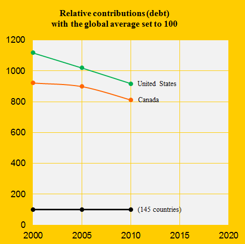
North America’s 7% of the Global Population accounted for 47% of the global Climate Contributions (climate debt) in ClimatePositions 2010. Canada was the 8th worst performing country out of 145 and United States was the 7th. Most indicators on Canada and United States follow the same trends over time, some with slightly different levels, however.
The diagram below shows the two countries’ Contributions per capita in 2000, 2005 and 2010, with the global average set at 100. The declining national shares is partly due to decreasing CO2 Emissions since 2008, but is especially caused by other large countries’ rapidly increasing proportions (China, Russia etc.).
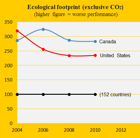
When it comes to Ecological Footprint (without CO2 Emissions) Canada and United States switched positions between 2004 and 2006 and since then United States has performed the best. As shown in the diagram below both countries has improved in recent years (from a very high level), compared to the global average set at 100.
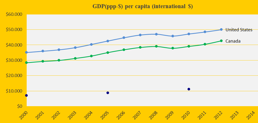
As shown in the last diagram United States is richer per capita than Canada (the blue dots are the global average). Here we have two democratic, rich countries with an enormous destructive impact on the planet’s climate and prospects.
A hypothetical example: If the global sea level had remained as in 2000, Canada would have saved 26 billion US$ in the latest version of ClimatePositions (updates from 2011 and 2012).
Data sources on ecological footprint: WWF reports “The Living Planet” published 2006-2012 (links in the menu “Calculations”).
Information on national GDP(ppp-$) per capita is from Worldbank (links in the menu “Calculations”). Read about GDP+ in the submenu ”Indicators”.
Front image is from Google Earth.
Comments are closed.