Climate change performance: China vs. the United States (wealth inequality)
2016
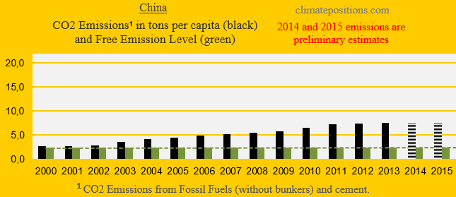
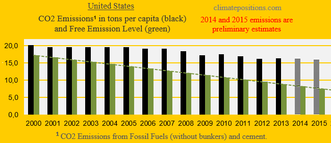
The diagrams below show the per capita CO2 Emissions from Fossil Fuel (without bunkers) and cement, annually since 2000, of China and the United States. The green bars show the Free Emission Level¹ – the exceedance is the basis for calculating the national Climate Debt. The world’s two largest CO2-emitters were responsible for 29% (China) and 15% of global emissions in 2015.
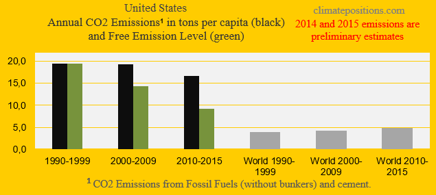
Apparently, China’s per capita emissions have peaked, while the moderate reduction-rate 2006-2012 of the United States, has flattened out.
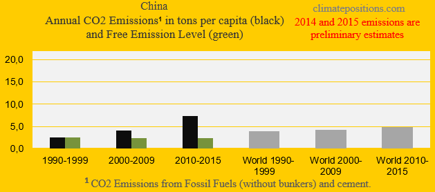
The next two diagrams show China’s the United States’ CO2 Emissions in tons per capita, in decades. The grey bars are world emissions average.
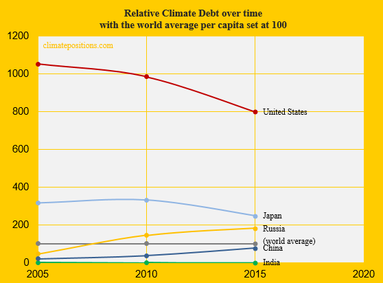
The diagram below shows the relative per capita Climate Debt of China and the United States, in comparison with the world’s 3rd, 4th and 5th largest emitters India, Russia and Japan – with the world’s average Climate Debt set at 100. If the last decade-trends of China and the United States are projected, then the per capita Climate Debt will be the same by 2038!
China’s per capita Climate Debt is $670 and the one of the United States is $6,637 (see the latest ‘Ranking’).
[Some figures in this article were corrected 22/5 2017]
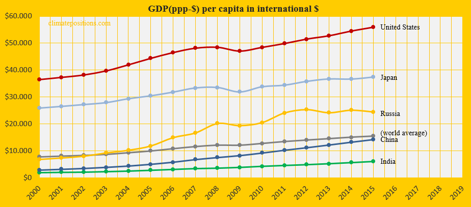
The diagram below shows the per capita GDP(ppp-$) of the same five countries and the world average. The wealth of China is just below world average, while the wealth of the United States is four times the one of China.
Among 144 countries with data on GINI coefficient² (wealth inequality) in ClimatePositions, 45 countries have Climate Debts exceeding $500 per capita – and within this country-group, China ranks 6th on inequality (only South Africa, Chile, Venezuela, Malaysia and Israel have more inequality), while the United States ranks 8th (Russia ranks 7th and Japan 29th). In other words, China and the United States belong to a small group of countries with both high climate change impact and large wealth inequality. The 45 countries account for 72% of the global CO2 Emissions from Fossil Fuels and cement, and 87% of the global Climate Debt.
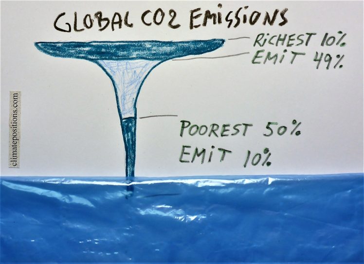
According to the report ‘Extreme Carbon Inequality‘ (pdf 14 pages, 2015), from Oxfam³, the poorest half of the global population are responsible for only around 10% of total global carbon emissions attributed to individual consumption, while around 50% of the emissions can be attributed to the richest 10% of people around the world. The findings suggest that the average per capita carbon footprints of the 10% richest is 11 times as high as the poorest half of the population, and 60 times as high as the poorest 10%. Furthermore, the average carbon footprint of the richest 1%, globally, could be 175 times that of the poorest 10%. Read also this ‘Article in The Guardian‘.
The Oxfam-report says about China and the United States: The poorest half of the Chinese population (over 600 million people) have a total carbon emissions footprint that is only one-third that of the richest 10% of US citizens (around 30 million people). The average carbon footprint of the 10% richest in the United States is around 50 tons per capita, while the carbon footprint of the poorest half is less than 7 tons. For comparison, the carbon footprint of the poorest half of the Chinese population is only around 0.74 tons per capita.
Consequently, poor people around the planet, also in rich countries like the United States, have the moral right to demand redistribution of prosperity (from the rich to the poor) due to loss and damages of global warming … generally speaking.
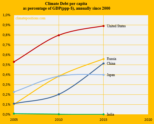
The next diagram (below) shows Climate Debt of the five countries calculated as percentage of GDP(ppp-$), annually since 2000. See the updated ‘Ranking’.
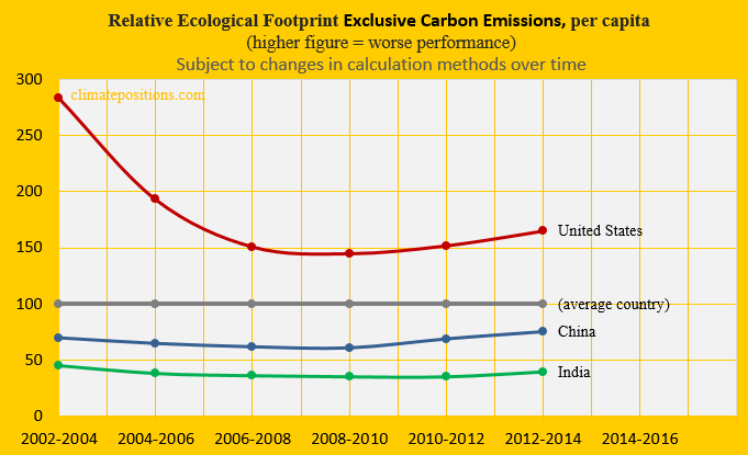
The next diagram shows the relative per capita Ecological Footprint without the carbon footprint, of China, the United States and India, with an average country set at 100. China’s footprint is below world average and considerably smaller than the one of the United States.
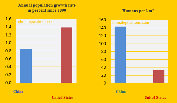
The last two diagrams show some Population trends. The Population growth rate of China, annually 2000-2015, is 0.9%, while the growth rate of the United States is 1.4%. However, an average km2 in China is populated by 143 people, while an average km2 in the United States is populated by only 33 people.
.
Finally, the table below shows four key values of the five countries when calculating national Climate Debts.
| . | Tons of CO2 | Price per | Climate change | Financing as |
| . | exceeded since | ton CO2 | financing | share of |
| . | 2000, per capita | since 2000 | per capita | Climate Debt |
| . | . | . | . | . |
| China | 47.05 | $7.86 | $0.01 | 0.00% |
| United States | 93.01 | $22.82 | $9.03 | 0.26% |
| India | 0.09 | $0.12 | $0.01 | 0.31% |
| Russia | 54.50 | $8.86 | $0.01 | 0.00% |
| Japan | 44.06 | $14.30 | $15.73 | 1.14% |
.
¹The Free Emission Level (green bars) is determined by national CO2 Emissions 1990-1999 (base), and 11 more ‘Indicators‘, of which 7 are national and 4 are global.
²’GINI coefficient‘ (wealth inequality): The Gini coefficient is usually defined mathematically based on the Lorenz curve, which plots the proportion of the total income of the population (y axis) that is cumulatively earned by the bottom x% of the population (see diagram). The line at 45 degrees thus represents perfect equality of incomes. The Gini coefficient can then be thought of as the ratio of the area that lies between the line of equality and the Lorenz curve. A case where the richest 20% have 80% of all income would lead to a Gini coefficient of at least 60%. If 1% of the world’s population owns 50% of all wealth, it would lead to a Gini coefficient of at least 49%. China’s ’GINI coefficient is 42.2% (2012) and the one of the United States is 41.1% (2013).
³’Oxfam‘ is an international confederation of 18 organizations networked together in more than 90 countries, as part of a global movement for change, to build a future free from the injustice of poverty.
.
Updated data and diagrams of all ‘Indicators‘ and all countries in ClimatePositions are available in the menu ‘Calculations (Excel)‘.
Data on carbon emissions (CO2 Emissions) from fossil fuels (without bunkers) and cement production are from Global Carbon Project (CDIAC); (links in the menu “Calculations”).
Information on national GDP(ppp-$) per capita: Worldbank (links in the menu “Calculations”).
Source on Ecological Footprint: Global Footprint Network (links in the menu “Calculations”).
Data on Populations is from Worldbank (links in the menu “Calculations”).
GINI coefficient by country is from ‘Wikipedia’.
Source on climate change financing (funding) is from Climate Funds Update (links in the menu “Calculations”).
Drawing by Claus Andersen, 2016 (the original diagram is from the report ‘Extreme Carbon Inequality‘).
Comments are closed.