Climate change performance: Japan vs. South Korea
2014
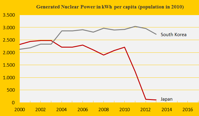
The first diagram shows the nuclear power generation per capita of the two countries. The Fukushima nuclear disaster in Japan in 2011 has caused a remarkable shutdown of generation – while CO2 Emissions from the burning of petroleum, coal and natural gas have increased (from 2011 to 2012 respectively by 6%, 5% and 3%) to close the energy gap. Nuclear power generation produce dangerous radioactive waste to deal with for thousands of future generations (10,000 to 250,000 years) and in ClimatePositions nuclear power is not accepted as a national CO2 Emission reduction instrument (read ‘more’). The following analyzes the indicator trends of Japan and South Korea.
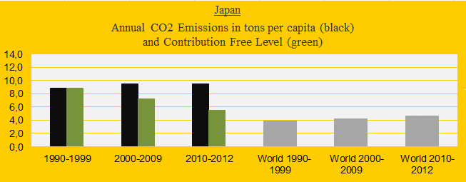
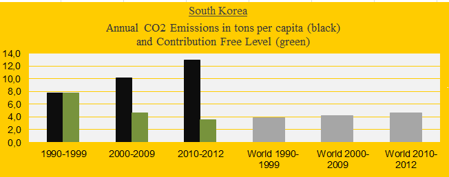
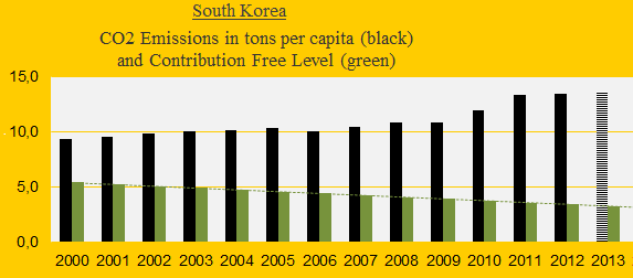
The two diagrams below show Japan’s and South Korea’s CO2 Emissions per capita in decades. The green bars show the Contribution Free Level and the grey bars are the world average. Japan has failed to reduce emissions since the 1990s while South Korea has increased emissions catastrophically.
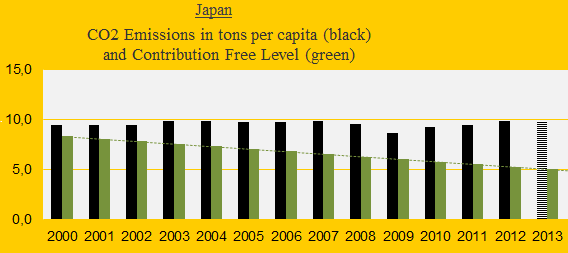
CO2 Emissions annually since 2000 are shown in the diagrams below. The Japanese CO2 cutbacks after the global financial crisis in 2008 have been succeeded by equivalent increases. South Korea seems to have abandoned all climate ambitions after the crashed climate summit in Copenhagen in 2009 (COP15).
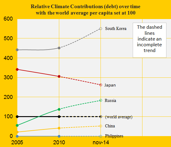
Japan’s updated climate debt per capita is $2,023 and South Korea’s is $4,237 (see the ‘ranking’). The diagram below shows the development in climate debt per capita since 2005, with the world average set at 100, in comparison with China, Russia and the Philippines. The latter is Contribution Free. South Korea’s climate debt is increasing faster than the global average and Japan is increasing more slowly.
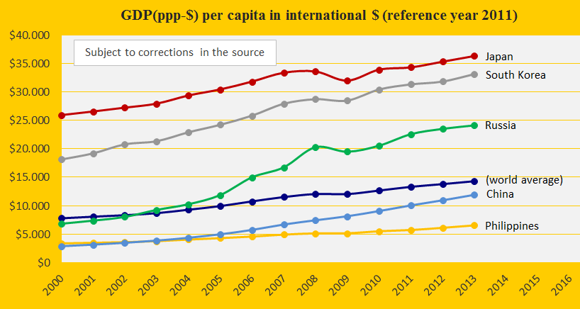
The next diagram shows the GDP(ppp-$) per capita of Japan, South Korea, China, Russia, the Philippines and the world average. Since 2009, the growth rates for Japan and South Korea were similar – which emphasizes the latter’s worse climate change performance (compiled in the last diagram).
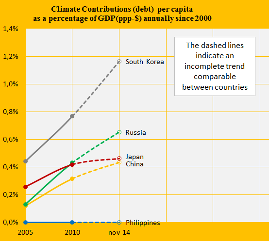
The last diagram (below) shows the accumulated Climate Contributions (climate debt) as percentages of the GDP(ppp-$) annually since 2000. Japan stands out with a deflected rate of increase, while South Korea, Russia and China continue in the irresponsible black track.
Among the trends that count positive for Japan and negative for South Korea are the indicators of the highly biodiverse Primary Forests. Japans Primary Forests has increased from 10.7% of the total area in 2000 to 12.6% in 2010 while South Korea’s has decreased from 42.9% to 29.7% (data of total Forest Cover is available ‘here’).
Japan has paid around $13 billion to global climate funds which is five times more than any other country. However, payments calculated as percentages of the Climate Contributions (climate debt) leaves Japan second to Norway, respectively with 4.7% and 11.4%. In comparison, South Korea has paid only 0.01% of the national climate debt to global climate funds.
.
Data on national nuclear power generation is from: World Nuclear Association (links in the menu “Calculations”).
Source on CO2 Emissions: EIA, U.S. Energy Information Administration and data on preliminary national CO2 Emissions are from Global Carbon Project (links in the menu “Calculations”).
Information on national GDP(ppp-$) per capita: Worldbank (links in the menu “Calculations”).
Sources on national forest cover and primary forests: United Nations (UN) (links in the menu “Calculations”).
Source on climate change funding is from Climate Funds Update (links in the menu “Calculations”).
Comments are closed.