Climate change performance of Spain, France and Italy

2015
2.5% of the global population live in Spain, France or Italy and together they emitted 3.3% of the global CO2 from fossil fuels in 2012 – the combined share of the global Climate Debt is 4.3%. Spain’s updated Climate Debt per capita is $1,692 (ranked 25th), France’s is $1,352 (ranked 31st) and Italy’s is $1,034 (ranked 35th). See the ‘ranking’. The following examines the Climate Debt trends and the indicators of CO2 Emissions (carbon dioxide from fossil fuels), GDP(ppp-$), Forests, Marine Protection and Nuclear Power.
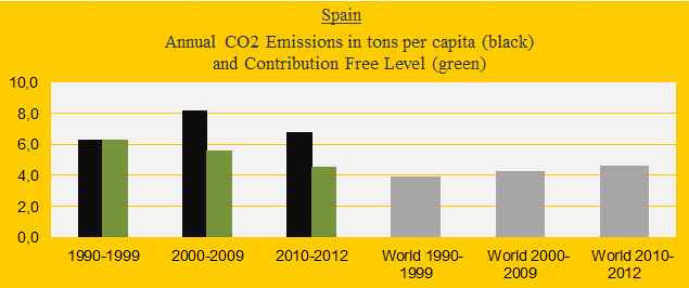
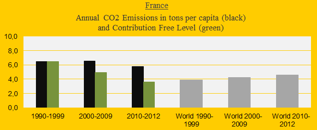
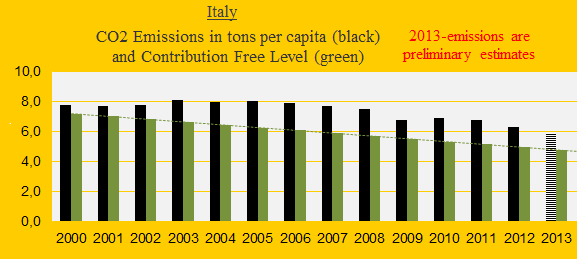
The three diagrams below show the CO2 Emissions per capita in decades of Spain, France and Italy in comparison with the world average (the grey bars). The green bars show the Contribution Free Level in ClimatePositions – the free level is determined by CO2 Emissions in 1990s and a number of continuously updated ‘indicators’.

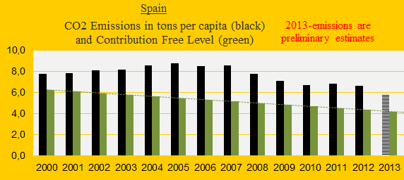
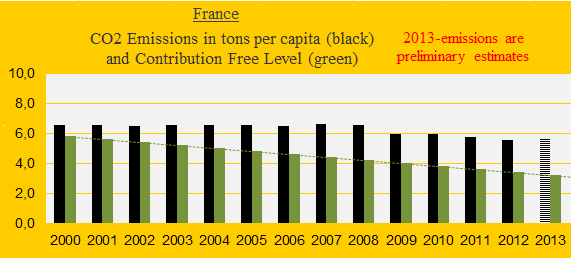
The next three diagrams show the CO2 Emissions per capita 2000-2013 (2013-emissions are preliminary estimates). The total amounts of CO2 Emissions exceeded per capita since 2000 are: Spain 34.0 tons, France 24.6 tons and Italy 19.4 tons. The exceeded emissions are the basis of the calculation of national Climate Debt.
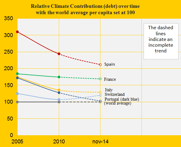
The diagram below shows the relative Climate Debt per capita since 2005 of Spain, France, Italy, Portugal and Switzerland, with the world average set at 100. All except Switzerland have continuously decreased the gap to the world average (note that the global climate debt has increased dramatically).
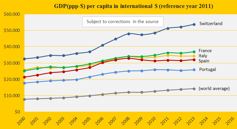
The GDP(ppp-$) per capita since 2000 of the same five countries, and the world average, is shown in the diagram below. Switzerland’s superior wealth is boosted by a so-called ‘tax haven‘ economy (unlike the others, Switzerland is not member of the European Union).
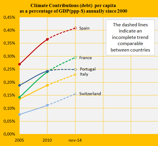
The Climate Debt calculated as percentages of the GDP(ppp-$) annually since 2000 are shown in the diagram below. Only Portugal has succeeded slowing down the growth rate considerably. See the ‘ranking’.
Spain has impressively increased the Forest Cover from 27.7% of the total area in 1990 to 36.4% in 2010 (but still 0.0% ‘Primary Forests’). The similar figures of France: Forest Cover from 26.4% to 29.0% (less than 0.1% Primary Forests). Italy: Forest Cover from 25.8% to 31.1% (0.3% Primary Forests).
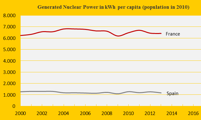
France is the world’s second largest Nuclear Power generator after the United States and the second largest per capita generator after Sweden (Spain is ranked 19th). The diagram below shows the per capita generation of France and Spain, since 2000.
In ClimatePositions Nuclear Power generation must be reduced at the same rate as CO2 Emissions from fossil fuels (otherwise the Contribution Free Level is reduced, as in the case of France and Spain) – as it is, large quantities of dangerous radioactive nuclear waste is left for hundreds of generations to deal with in the future.
A hypothetical example: If Spain had remained the level of CO2 Emissions since 1990s (6.3 tons per capita) until today, then the present Climate Debt would have been $727 per capita instead of $1,692. If furthermore the minor Spanish Nuclear Power generation had been shut down in 2000, then the Climate Debt would have been $514 (and the ranking would have been 44th instead of 25th).
.
Source on Ecological Footprint: WWF reports “The Living Planet” published 2006-2014 (links in the menu “Calculations”).
Information on national GDP(ppp-$) per capita: Worldbank (links in the menu “Calculations”).
Source on CO2 Emissions: EIA, U.S. Energy Information Administration and data on preliminary national CO2 Emissions are from Global Carbon Project (links in the menu “Calculations”).
Data on national and global Populations: EIA, U.S. Energy Information Administration (links in the menu “Calculations”).
Source on Environmental Performance: Yale and Columbia University reports, published 2006-2014 (links in the menu “Calculations”).
Image with countries and flags by Claus Andersen, 2015.
Comments are closed.