Climate Debt: Australia ranks 8th (performance of the twenty largest coal producers)

2016
Australia covers around 5.7% of planet’s land area and populates 0.3% of its people. The Climate Debt of the 24 million Australian’s amounts to $132 billion, or $5,613 per capita, which ‘Ranks’ Australia 8th among 148 countries – in 2010 the ranking was 6th. Australia is the world’s 5th largest coal producer and the 2nd largest per capita CO2 emitter from coal combustion … and coal is the most efficient climate destroyer. The table below reveals some key figures of the world’s twenty largest coal producers. Subsequently, Australia’s climate change performance is examined in comparison with four other top-five countries on CO2 Emissions from coal combustion (per capita): Kazakhstan (ranked 1), South Africa (3), the United States (4) and Poland (5).
The table reads as follows: Australia is the world’s 5th largest coal producer, responsible for 5.8% of the world’s coal production in 2012. The CO2 Emissions from burning of coal in Australia amounted to 9.5 tons per capita in 2012 which was the 2nd highest among the 20 listed countries. The CO2 Emissions from fossil fuels and cement production amounted to 16.0 tons per capita in 2012 and 57% was caused by coal combustion. The current Australian Climate Debt accumulated since 2000 amounted to 1.05% of the GDP(ppp-$), annually, which ‘Ranks‘ Australia 8th among 148 countries in ClimatePositions.
The twenty countries represent around 51% of the planet’s land area, 58% of the population, 67% of the Climate Debt and 98% of the coal production.
According to ‘Australian Energy Update 2015‘ Australia’s coal production (petajoules) was 7.7%¹ higher in 2013-2014 than the year before. Exports of black coal (almost 95% of the Australian coal production) increased by 12% in 2013-2014. Read this article from The Guardian (Aug. 2015): ‘World’s biggest coal port joins fossil fuel divestment push’.
| . | . | . | Tons of CO2 from | Tons of CO2 from | Climate Debt as |
| . | . | Share of global | coal consumption | fossils fuels and | share of GDP |
| . | . | coal production | per capita | cement, per capita | annually 2016 |
| . | . | 2012 | 2012 (20-rank) | 2012 (coal’s share) | (148-rank) |
| . | . | . | . | . | . |
| 1. | China | 47.9% | 4.8 (7) | 6.8 (71%) | 0.51% (21) |
| 2. | United States | 12.6% | 5.3 (4) | 16.3 (33%) | 0.96% (10) |
| 3. | Indonesia | 6.9% | 0.6 (19) | 2.4 (24%) | 0.11% (62) |
| 4. | India | 6.5% | 1.0 (17) | 1.8 (57%) | 0.02% (81) |
| 5. | Australia | 5.8% | 9.5 (2) | 16.0 (59%) | 1.05% (8) |
| 6. | Russia | 4.6% | 3.3 (10) | 12.7 (26%) | 0.64% (14) |
| 7. | South Africa | 3.7% | 7.3 (3) | 8.9 (81%) | 0.45% (23) |
| 8. | Colombia | 1.5% | 0.3 (20) | 1.6 (20%) | 0% |
| 9. | Poland | 1.4% | 5.0 (5) | 8.1 (62%) | 0.26% (44) |
| 10. | Kazakhstan | 1.4% | 9.7 (1) | 15.5 (63%) | 0.87% (12) |
| 11. | Germany | 1.2% | 3.7 (9) | 9.3 (40%) | 0.29% (39) |
| 12. | Canada | 0.9% | 2.6 (14) | 13.7 (19%) | 0.92% (11) |
| 13. | Ukraine | 0.9% | 3.2 (11) | 6.1 (52%) | 0.02% (84) |
| 14. | Vietnam | 0.6% | 0.7 (18) | 1.9 (35%) | 0.03% (76) |
| 15. | Korea, North | 0.6% | 2.6 (13) | 3.1 (85%) | 0%² |
| 16. | Mongolia | 0.4% | 2.9 (12) | 7.0 (41%) | 0.28% (42) |
| 17. | Czech Republic | 0.4% | 4.8 (8) | 10.0 (47%) | 0.42% (28) |
| 18. | Turkey | 0.4% | 1.7 (16) | 4.5 (37%) | 0.21% (50) |
| 19. | United Kingdom | 0.2% | 2.3 (15) | 7.3 (32%) | 0.21% (51) |
| 20. | Serbia | 0.2% | 4.9 (6) | 6.4 (77%) | 0.33% (37) |
The first diagram shows the per capita CO2 Emissions from fossil fuels (without bunker fuels) and cement production in decades in comparison with the world average. CO2 Emissions since 2012 are preliminary estimates. The green bars are the Contribution Free Level, determined by the level of CO2 Emissions in the 1990s and a number of continuously updated ‘Indicators’.

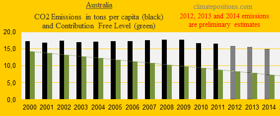
The next diagram shows the per capita CO2 Emissions from fossil fuels (without bunker fuels) and cement production since 2000. CO2 Emissions in 2012, 2013 and 2014 are preliminary estimates. The CO2 Emissions from coal combustion increased gradually by 75% between 1990 and 2009 – in 2012 emissions was 9% lower than the record year of 2009 (during this period the renewable electricity generation (Btu) as share of the total energy production (Btu) increased only from 1.6% to 1.8%).
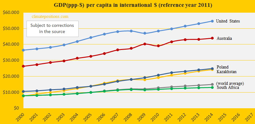
In 2014 the Australia was the 18th wealthiest country among 148 with full data in ClimatePositions. The diagram below shows the development in GDP(ppp-$) since 2000, in comparison with Kazakhstan, South Africa, the United States, Poland and the world average.
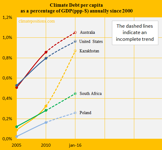
The Climate Debts share of the GDP(ppp-$), annually since 2000, was 1.05% by January 2016 (‘Ranked’ 8th). The development since 2005 is shown in the diagram below, along with the same group of countries.
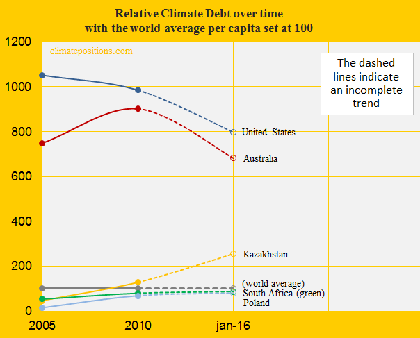
The last diagram shows the relative Climate Debt of the same countries since 2005, with the world average set at 100. Note that the dashed lines are based on preliminary estimates.
¹Black coal production in Australia increased by 8% in 2013–14, to reach 11,807 petajoules (around 428 million tons) and Brown coal production declined by 3%, to reach 625 petajoules (around 61 million tons).
²Due to missing data on GDP(ppp-$) North Korea is not included in the rankings of ClimatePositions. However, the authoritarian regime is de facto Climate Debt Free..
A hypothetical example: If Australia had started its CO2 Emission cuts ten years earlier, in 2000 instead of 2010, and continued the reduction rate till 2014, then the current per capita Climate Debt would have been $1,985 instead of $5,613, and the ranking would have been 19th instead of 8th.
.
Updated data and diagrams of all ‘Indicators’ and all countries in ClimatePositions are available in the menu ‘Calculations (Excel)’.
Data on carbon emissions (CO2 Emissions) from fossil fuels (without bunkers) and cement production are from Global Carbon Project (CDIAC); (links in the menu “Calculations”).
Data on energy production and consumption is from ‘U.S. Energy Information Administration (EIA)’.
Information on national GDP(ppp-$) per capita: Worldbank (links in the menu “Calculations”).
Data on national and global Populations is from Worldbank (links in the menu “Calculations”).
Drawing by Claus Andersen, 2016.
Comments are closed.