IPCC worst case scenarios from 1990 and 2014 (in comparison with the actual global warming)

2014
In October 2014 IPCC’s Fifth Assessment Synthesis Report 2014 was released (IPCC = Intergovernmental Panel on Climate Change). The Summary for Policymakers (40 pages), the Headline Statements (2 pages), the Presentation (PowerPoint, 26 dias) and a Longer Report (116 pages) are available ‘here’. The four sub-reports 2013-2014 (a total of 5622 pages) are available ‘here’. The presentation of the gloomy message is overwhelming and totally confusing to common people (is that really necessary?).
Below are six essential IPCC-quotes:
- “Anthropogenic greenhouse gas emissions have increased since the pre-industrial era, driven largely by economic and population growth, and are now higher than ever.”
- “Cumulative emissions of carbon dioxide largely determine global mean surface warming by the late 21st century and beyond.”
- “Surface temperature is projected to rise over the 21st century under all assessed emission scenarios.”
- “Many aspects of climate change and associated impacts will continue for centuries, even if anthropogenic emissions of greenhouse gases are stopped.”
- “The risks of abrupt or irreversible changes increase as the magnitude of the warming increases.”
- “There are multiple mitigation pathways that are likely to limit warming to below 2°C relative to pre-industrial levels. These pathways would require substantial emissions reductions over the next few decades and near zero emissions of carbon dioxide and other long-lived greenhouse gases by the end of the century.”
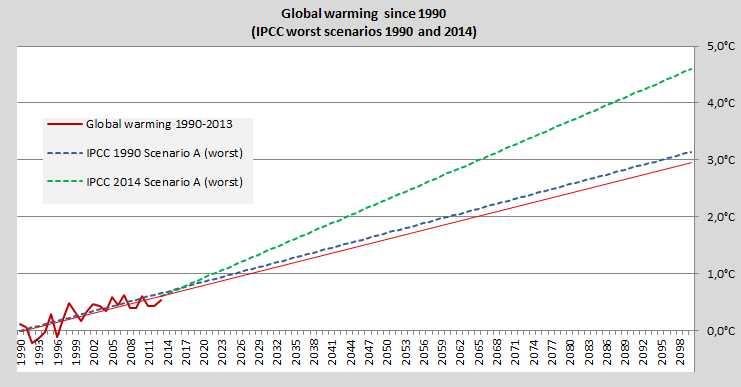
Both in 1990 (all reports since 1990 are available ‘here‘) and in 2014 the IPCC operates with four scenarios for global warming by 2100. The simplistic (unscientific) diagram below shows only the worst case scenarios from 1990 (the blue dashed line) and 2014 (the green dashed line) – in comparison with the actual increase of land surface temperature since 1990 (the red line with a linear projection by 2100). It seems that the IPCC has expanded the frame considerably the last 24 years for how horrifying climate change might escalate. The global CO2 Emissions from fossil fuels have increased by 61% since 1990 and the annual record is beaten every year.
.
All the ‘IPCC Reports since 1990‘.
Source of ‘Global Land Temperature‘ (data since 1880).
Source of ‘Carbon Dioxide Emissions‘ (data since 1980).
Drawing by Claus Andersen 2014.
Comments are closed.