Climate change performance: Australia vs. New Zealand
2015
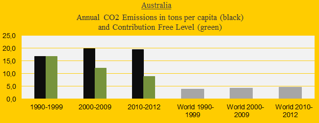
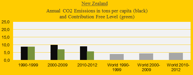
The two diagrams below show Australia’s and New Zealand’s CO2 Emissions from fossil fuels per capita in decades. The green bars show the Contribution Free Level and the grey bars are the world average. The average Australian per capita emissions were 16.7 tons in 1990s and 19.7 tons in 2000-2012 (18% increase). The corresponding figures of New Zealand were 8.7 tons and 9.5 tons (10% increase).
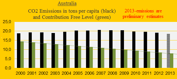
CO2 Emissions per capita annually since 2000 are shown in the two diagrams below. Moderate reductions of both countries since the financial crisis in 2008 and the crashed climate summit in Copenhagen in 2009 (COP15) might (might not?) indicate new approaches.

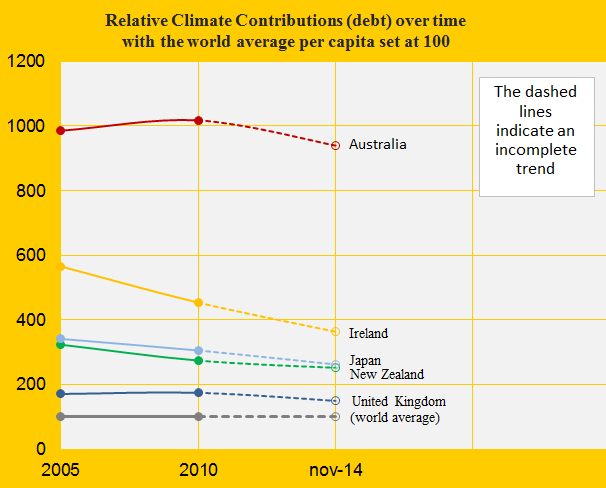
Australia’s updated Climate Debt is $7,473 per capita (ranked 9th) and New Zealand’s is $2,011 (ranked 21st). See the ‘ranking’. The diagram below shows the development in Climate Debt per capita since 2005, with the world average set at 100, in comparison with United Kingdom, Ireland and Japan. The Australian climate change performance since 2000 is outrageous – an average Australian has exceeded the Contribution Free Level of CO2 Emissions from fossil fuels by 119 tons in the period 2000 to 2013, whereas New Zealand has exceeded by 41 tons.
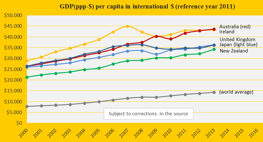
The next diagram shows the GDP(ppp-$) per capita of Australia, New Zealand, United Kingdom, Ireland, Japan and the world average. Among these countries Australia has the fastest growing economy during the period, disregarded the effect on the climate systems and the lives of future generations.
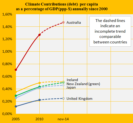
The diagram below shows the accumulated Climate Contributions Debt as percentages of the GDP(ppp–$) annually since 2000. Calculated this way Australia is ranked 7th among 147 countries and New Zealand is ranked 23rd (see the ‘ranking’).
The last diagram (below) shows the relative per capita ‘Ecological Footprint’ (without CO2 Emissions) of Australia, New Zealand and the United States, with an average country set at 100. The impressive improvement of New Zealand is second to none among 155 countries. New Zealand has improved especially on Grazing and Fishing Grounds.
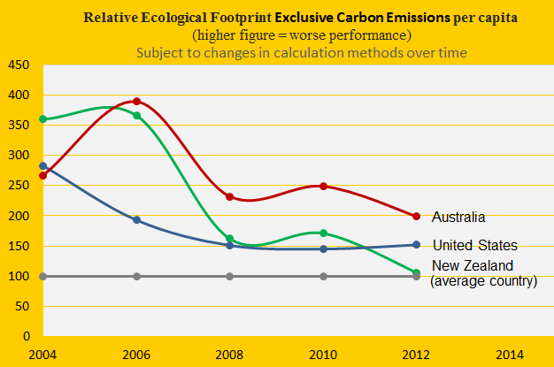
A hypothetical example: Had New Zealand maintained the huge Ecological Footprint (without CO2 Emissions) of 2004, until 2012, then the Climate Debt would have been 8% higher than the present. Had the footprint instead been small as in 2012 during the period, then the Climate Debt would have been 8% lower than the present.
.
Source on CO2 Emissions: EIA, U.S. Energy Information Administration and data on preliminary national CO2 Emissions are from Global Carbon Project (links in the menu “Calculations”).
Information on national GDP(ppp-$) per capita: Worldbank (links in the menu “Calculations”).
Source on Ecological Footprint: WWF reports “The Living Planet” published 2006-2014 (links in the menu “Calculations”).
Drawing by Claus Andersen, 2015.
Comments are closed.