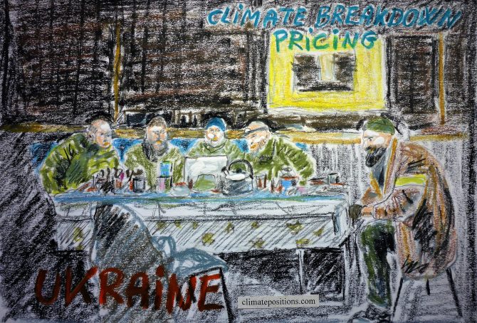
Ukraine – per capita Fossil CO2 Emissions and Climate Debt
2020
Ukraine’s current Climate Breakdown Pricing amounts to $0.82 per tons Fossil CO2 emitted since 2000. The Climate Debt grew from $44 per capita in 2015 to $105 in 2020. Updated Rankings of 165 countries are available in the menu “Climate Debt”.
The following diagrams expose the trends of Fossil CO2 Emissions, Climate Debt, GDP(ppp-$), Nuclear Power and Ecological Footprint without carbon.

Argentina – per capita Fossil CO2 Emissions and Climate Debt
2020
Argentina’s current Climate Breakdown Pricing amounts to $10.19 per tons Fossil CO2 emitted since 2000. The Climate Debt grew from $420 per capita in 2015 to $928 in 2020. Updated Rankings of 165 countries are available in the menu “Climate Debt”.
The following diagrams expose the trends of Fossil CO2 Emissions, Climate Debt, GDP(ppp-$) and Ecological Footprint without carbon.
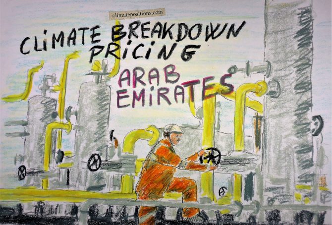
United Arab Emirates (UAE) – per capita Fossil CO2 Emissions and Climate Debt
2020
The current Climate Breakdown Pricing of The United Arab Emirates (UAE) amounts to $30.81 per tons Fossil CO2 emitted since 2000. The Climate Debt grew from $6,522 per capita in 2015 to $14,139 in 2020. Updated Rankings of 165 countries are available in the menu “Climate Debt”.
The following diagrams expose the trends of Fossil CO2 Emissions, Climate Debt, GDP(ppp-$), Population and Ecological Footprint without carbon.

Egypt – per capita Fossil CO2 Emissions and Climate Debt
2020
Egypt’s current Climate Breakdown Pricing amounts to $3.58 per tons Fossil CO2 emitted since 2000. The Climate Debt grew from $79 per capita in 2015 to $161 in 2020. Updated Rankings of 165 countries are available in the menu “Climate Debt”.
The following diagrams expose the trends of Fossil CO2 Emissions, Climate Debt and GDP(ppp-$).

Malaysia – per capita Fossil CO2 Emissions and Climate Debt
2020
Malaysia’s current Climate Breakdown Pricing amounts to $20.82 per tons Fossil CO2 emitted since 2000. The Climate Debt grew from $1,454 per capita in 2015 to $2,902 in 2020. Updated Rankings of 165 countries are available in the menu “Climate Debt”.
The following diagrams expose the trends of Fossil CO2 Emissions, Climate Debt, GDP(ppp-$) and Ecological Footprint without carbon.
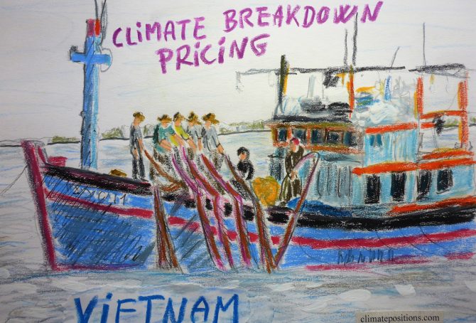
Vietnam – per capita Fossil CO2 Emissions and Climate Debt
2020
Vietnam’s current Climate Breakdown Pricing amounts to $0.88 per tons Fossil CO2 emitted since 2000. The Climate Debt grew from $6 per capita in 2015 to $26 in 2020. Updated Rankings of 165 countries are available in the menu “Climate Debt”.
The following diagrams expose the trends of Fossil CO2 Emissions, Climate Debt, GDP(ppp-$), Forest Cover, Primary Forest and Ecological Footprint without carbon.
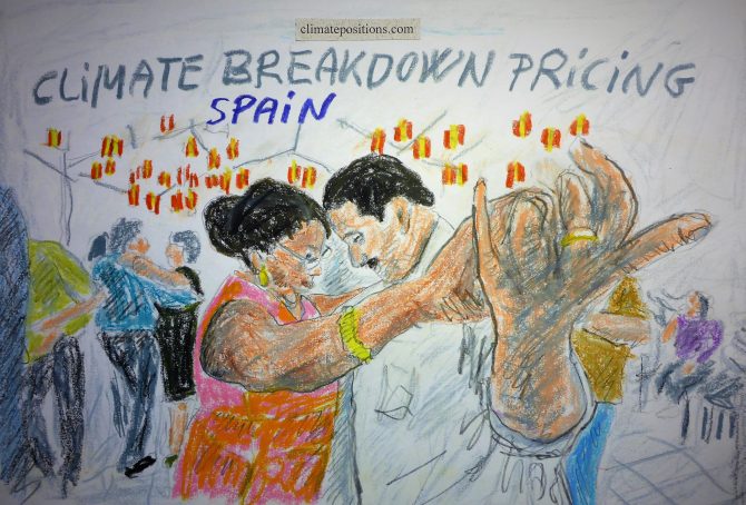
Spain – per capita Fossil CO2 Emissions and Climate Debt
2020
Spain’s current Climate Breakdown Pricing amounts to $16.05 per tons Fossil CO2 emitted since 2000. The Climate Debt grew from $1,173 per capita in 2015 to $2,110 in 2020. Updated Rankings of 165 countries are available in the menu “Climate Debt”.
The following diagrams expose the trends of Fossil CO2 Emissions, Climate Debt, GDP(ppp-$) and Ecological Footprint without carbon.

Thailand – per capita Fossil CO2 Emissions and Climate Debt
2020
Thailand’s current Climate Breakdown Pricing amounts to $7.92 per tons Fossil CO2 emitted since 2000. The Climate Debt grew from $265 per capita in 2015 to $535 in 2020. Updated Rankings of 165 countries are available in the menu “Climate Debt”.
The following diagrams expose the trends of Fossil CO2 Emissions, Climate Debt, GDP(ppp-$) and Ecological Footprint without carbon.

Taiwan – per capita Fossil CO2 Emissions and Climate Debt (estimated)
2020
Due to lack of some indicator data from the ‘sources‘ Taiwan is not ranked in ClimatePositions. However, by estimating the indicator values of GDP(ppp-$)¹, Forest Cover² and Ecological Footprint³, then the calculation of Taiwan’s Climate Debt can still be made with some accuracy.
With the noted indicator assumptions, then the Taiwanese current Climate Breakdown Pricing amounts to $40 per tons Fossil CO2 emitted since 2000, and the per capita Climate Debt amounts to $8,800 in 2020. For comparison, updated Rankings of 165 countries with full data are available in the menu “Climate Debt” (Taiwan ranks 13th).
The following diagrams expose the trends of Fossil CO2 Emissions, Nuclear Power and Environmental Performance.
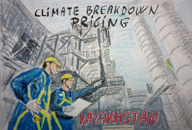
Kazakhstan – per capita Fossil CO2 Emissions and Climate Debt
2020
Kazakhstan’s current Climate Breakdown Pricing amounts to $16.18 per tons Fossil CO2 emitted since 2000. The Climate Debt grew from $2,041 per capita in 2015 to $4,025 in 2020. Updated Rankings of 165 countries are available in the menu “Climate Debt”.
The following diagrams expose the trends of Fossil CO2 Emissions, Climate Debt, GDP(ppp-$) and Ecological Footprint without carbon.

France – per capita Fossil CO2 Emissions and Climate Debt
2020
The current Climate Breakdown Pricing of France amounts to $16.87 per tons Fossil CO2 emitted since 2000. The Climate Debt grew from $953 per capita in 2015 to $1,876 in 2020. Updated Rankings of 165 countries are available in the menu “Climate Debt”.
The following diagrams expose the trends of Fossil CO2 Emissions, Climate Debt, GDP(ppp-$), Nuclear Power and Ecological Footprint without carbon.
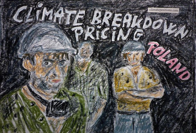
Poland – per capita Fossil CO2 Emissions and Climate Debt
2020
Poland’s current Climate Breakdown Pricing amounts to $9.87 per tons Fossil CO2 emitted since 2000. The Climate Debt grew from $593 per capita in 2015 to $1,555 in 2020. Updated Rankings of 165 countries are available in the menu “Climate Debt”.
The following diagrams expose the trends of Fossil CO2 Emissions, Climate Debt, GDP(ppp-$) and Ecological Footprint without carbon.

Italy – per capita Fossil CO2 Emissions and Climate Debt
2020
Italy’s current Climate Breakdown Pricing amounts to $13.47 per tons Fossil CO2 emitted since 2000. The Climate Debt grew from $1,003 per capita in 2015 to $1,841 in 2020. Updated Rankings of 165 countries are available in the menu “Climate Debt”.
The following diagrams expose the trends of Fossil CO2 Emissions, Climate Debt, GDP(ppp-$) and Ecological Footprint without carbon.

United Kingdom – per capita Fossil CO2 Emissions and Climate Debt
2020
The current Climate Breakdown Pricing of the United Kingdom amounts to $11.17 per tons Fossil CO2 emitted since 2000. The Climate Debt grew from $871 per capita in 2015 to $1,614 in 2020. Updated Rankings of 165 countries are available in the menu “Climate Debt”.
The following diagrams expose the trends of Fossil CO2 Emissions, Climate Debt, GDP(ppp-$), Nuclear Power and Ecological Footprint without carbon.
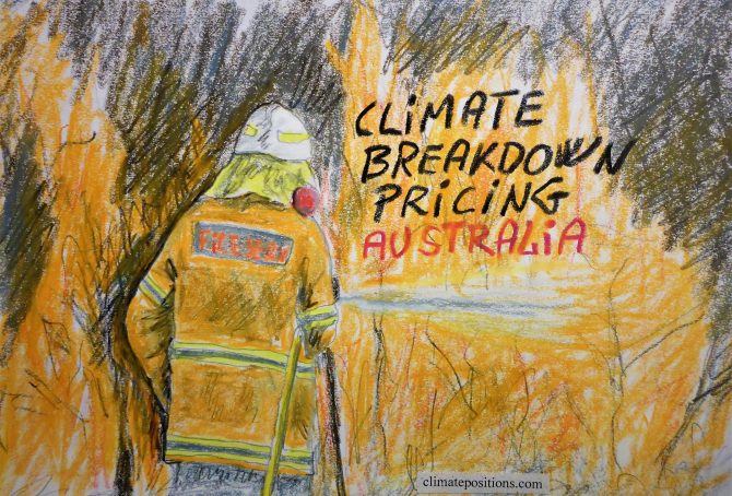
Australia – per capita Fossil CO2 Emissions and Climate Debt
2020
Australia’s current Climate Breakdown Pricing amounts to $32.40 per tons Fossil CO2 emitted since 2000. The Climate Debt grew from $6,547 per capita in 2015 to $11,256 in 2020. Updated Rankings of 165 countries are available in the menu “Climate Debt”.
The following diagrams expose the trends of Fossil CO2 Emissions, Climate Debt, GDP(ppp-$) and Ecological Footprint without carbon.

Turkey – per capita Fossil CO2 Emissions and Climate Debt
2020
Turkey’s current Climate Breakdown Pricing amounts to $13.04 per tons Fossil CO2 emitted since 2000. The Climate Debt grew from $401 per capita in 2015 to $1,040 in 2020. Updated Rankings of 165 countries are available in the menu “Climate Debt”.
The following diagrams expose the trends of Fossil CO2 Emissions, Climate Debt, GDP(ppp-$) and Ecological Footprint without carbon.

South Africa – per capita Fossil CO2 Emissions and Climate Debt
2020
South Africa’s current Climate Breakdown Pricing amounts to $8.30 per tons Fossil CO2 emitted since 2000. The Climate Debt grew from $593 per capita in 2015 to $1,355 in 2020. Updated Rankings of 165 countries are available in the menu “Climate Debt”.
The following diagrams expose the trends of Fossil CO2 Emissions, Climate Debt, GDP(ppp-$) and Ecological Footprint without carbon.

Mexico – per capita Fossil CO2 Emissions and Climate Debt
2020
Mexico’s current Climate Breakdown Pricing amounts to $8.71 per tons Fossil CO2 emitted since 2000. The Climate Debt grew from $291 per capita in 2015 to $662 in 2020. Updated Rankings of 165 countries are available in the menu “Climate Debt”.
The following diagrams expose the trends of Fossil CO2 Emissions, Climate Debt, GDP(ppp-$), Nuclear Power and Ecological Footprint without carbon.
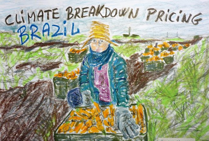
Brazil – per capita Fossil CO2 Emissions and Climate Debt
2020
Brazil’s current Climate Breakdown Pricing amounts to $5.74 per tons Fossil CO2 emitted since 2000. The Climate Debt grew from $108 per capita in 2015 to $246 in 2020. Updated Rankings of 165 countries are available in the menu “Climate Debt”.
The following diagrams expose the trends of Fossil CO2 Emissions, Climate Debt, GDP(ppp-$), Ecological Footprint without carbon, Forest Cover and Primary Forest.

Indonesia – per capita Fossil CO2 Emissions and Climate Debt
2020
Indonesia’s current Climate Breakdown Pricing amounts to $4.50 per tons Fossil CO2 emitted since 2000. The Climate Debt grew from $82 per capita in 2015 to $147 in 2020. Updated Rankings of 165 countries are available in the menu “Climate Debt”.
The following diagrams expose the trends of Fossil CO2 Emissions, Climate Debt, GDP(ppp-$), Ecological Footprint without carbon, Forest Cover and Primary Forest.