
Global warming: China in its own CO2 Emission league
2013
Global warming is caused mainly by human CO2 Emissions.The diagram above shows China’s annual CO2 Emissions (carbon dioxide) in tons per capita 2000-2011 (the black bars). The green bars show the Contribution Free Levels in ClimatePositions. The free level of CO2 Emissions is dependent on various indicators (see the menu “Calculations/Indicators”). China was the 57th worst performing country out of 145, in terms of Contribution (climate debt) per capita. The total national Contribution increased from 26 billion US$ in 2005 to 185 billion in 2010. This explosive negative development is outstanding in the world and China is now by far the largest CO2 Emitter.
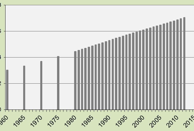
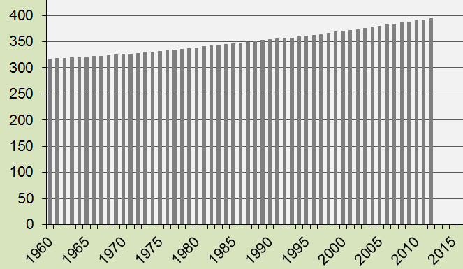
Global Population 1960-2012
2013
The diagram shows the Global Population the last 52 years. In 1960 the Global Population was 3.02 billion and in 2012 it was 7.03 billion. The annually updated figure is included in the latest version of ClimatePositions with impact on the national Climate Contributions (climate debt).
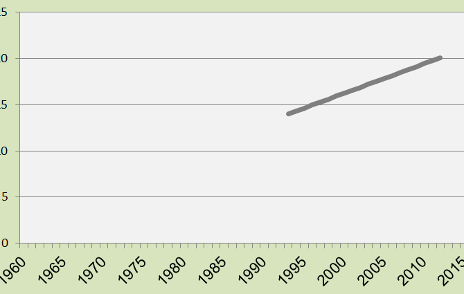
Global Sea Level 1993-2012
2013
The diagram shows the global Sea Level rise between 1993 and 2012. Annually the average increase was 3.2 mm (a total of 6.08 cm in 19 years). The increase between 1880 and 1993 is set to 14 cm (uncertain data). The annually updated Sea Level affects the national Climate Contributions in ClimatePositions.
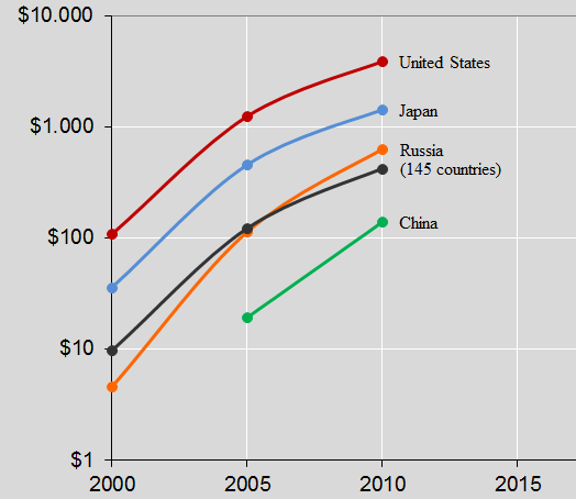
Top 5 CO2 Emitters’ Climate Contributions (climate debt) over time
2013
The 5 largest CO2 Emitters in 2006-2010 were 1. China (23,2%), 2. United States (19,7%), 3. Russia (5,3%), 4. India (5,1%) and 5. Japan (4,0%). These 5 countries accounted for 57,3% of the global CO2 Emissions (carbon dioxide). The diagram above shows the Contributions (climate debt) per capita in 2000, 2005 and 2010 (the black line is the global average). India was Contribution Free. Note the logarithmic scale. On the list of the worst performing countries (climate debt per capita) the ranking in 2010 was as follows: United States (no. 7), Japan (no. 18), Russia (no. 31), China (no. 57) and India (Contribution Free). See the full country list in the menu Contributions/Per Capita US$ Rank.
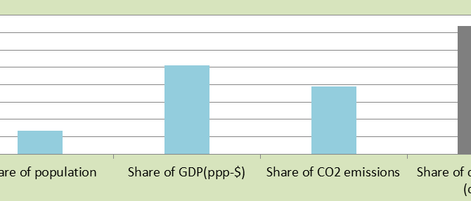
Full Democracies means large Climate Contributions (climate debt)
2013
The diagram shows 23 Full Democracy countries’ total share of the global: 1) Population (13%), 2) GDP(ppp-$) (51%), 3) CO2 Emissions (39%) and 4) Contributions (debt) (74%). Only 1/8 of the people on the planet live in other words in Full Democracies and they are accountable for 3/4 of the global Contributions (climate debt) in ClimatePositions 2010. Also the ecological footprint (excluding CO2 Emissions) of a majority of these 23 countries is very large, with an average of 2.7 EPI. Obviously democracies in general are still flawed when it comes to planet responsibility and climate change response. Costa Rica is the only Contribution Free country on the Full Democracy list (more about Costa Rica soon).
CO2 Content in the atmosphere since 1960
2013
The diagram shows the concentration of CO2 (carbon dioxide) in the atmosphere as parts per million (ppm) 1960-2012. In 1960 the figure was 317 ppm and in 2012 it was 394 ppm. The annually updated figure is included in the latest version of ClimatePositions with impact on the national Climate Contributions.

Rainforest in Ecuador and global funding
2013
Ecuador was the 68th worst performing country out of 145 in ClimatePositions 2010, but the Climate Contribution (debt) was entirely due to reductions in rainforest since 1990. The diagram shows the forest coverage in percent of the total area in 1990 (49.9%) and 2010 (35.6%). The total national Contribution (debt) was 626 million US$ in 2010.
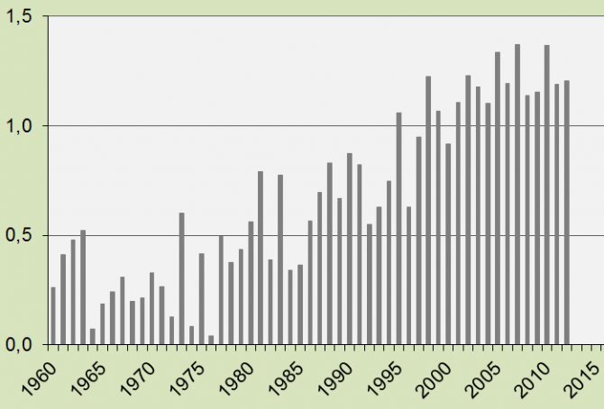
Global Air Temperature since 1960
2013
If the increase in average global land Air Temperature in 1880-1939 is set to 0ºC, the increase in temperature in 1960-2012 is shown in the diagram. The average increase in temperature in the last decade was 1.22 ºC – this figure is included in the latest version of ClimatePositions calculations (Excel).