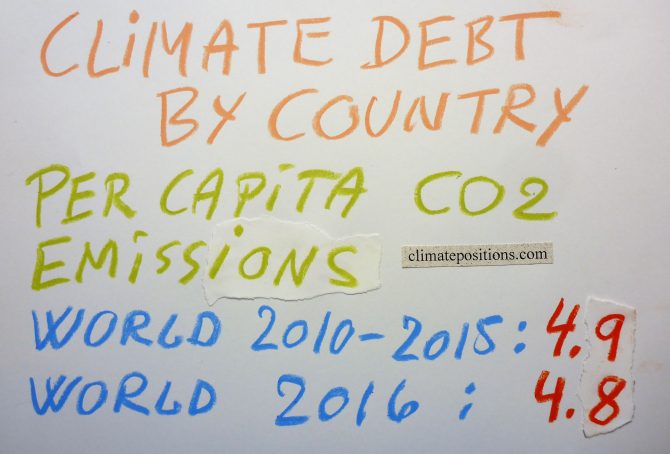
Updated Climate Debt of 163 countries (per capita Fossil CO2 Emissions 1990-2016)
2017
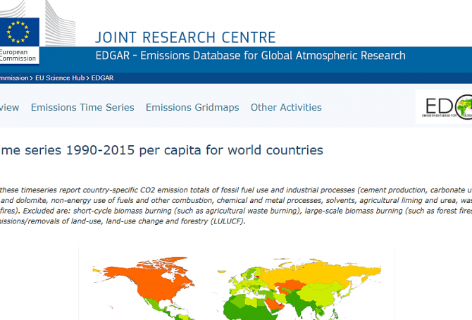
National per capita CO2 Emissions from Fossil Fuels (without bunkers) and industrial processes in 2016 have been released by ‘EDGAR‘. At the same time, recalculated historic emissions have been released, which for some countries make a considerable difference¹ (also with regard to Climate Debt in ClimatePositions). The updated calculations are available in ‘Calculation (Excel)‘, and new rankings of 163 countries are available in the menu “Climate Debt”.
The table below shows World average, and the 15 countries with the largest per capita CO2 Emissions from Fossil Fuels and industrial processes in 2016, in tons, in comparison with average emissions 1990-1999, 2000-2009 and 2010-2015.
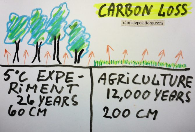
Two studies: 26-year soil warming experiment in a mid-latitude hardwood forest (possible self-reinforcing carbon emissions feedback loop) and 12,000 years of soil carbon losses from agriculture
2017
In continuation of the previous article about aboveground forest carbon losses, the following is about soil carbon losses due to warming and agriculture, respectively.
Melillo et al. performed a ‘26-year soil-warming experiment‘ in a mid-latitude mixed hardwood forest with results published October 2017 in the peer-review journal Science. Some forest areas (plots) were heated up with underground cables to 5°C above normal levels, while other forest areas were left as a control. The experiment then documented changes in soil carbon cycling in the top 60 cm and investigated the possible consequences for the climate system.
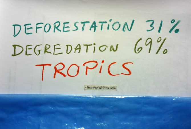
Study: Tropical forests now release twice as much carbon than they absorb
2017
A new ‘Study‘ from ‘Woods Hole Research Center‘ and Boston University reveals tropical forests now emit twice as much carbon than they capture. This is alarming news, since forests are the only carbon capture and storage “technology” that is safe, inexpensive and immediately available.
New approach to measuring forest carbon density using 1) satellite imagery 2003-2014, 2) laser remote sensing technology and 3) field measurements, were able to capture aboveground losses in forest carbon from full-scale deforestation as well as fine-scale degradation and disturbance. The latter has previously been a challenge to the scientific community over large areas. According to the study tropical forests in Americas, Africa and Asia are now releasing 425 (± 22%) teragrams (million tons) of carbon annually¹, equivalent to more than 4% (calculated by me) of global CO2 Emissions from Fossil Fuels and industrial processes. For perspectivation, global CO2 Emissions dropped 0.34% in 2016 compared to 2015.
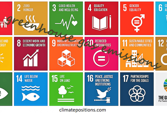
UN Sustainable Development Goals (Global Goals) and greenhouse gas emissions
2017
UNs 17 ‘Sustainable Development Goals‘, or Global Goals, consist of simple headings with underlying ‘Clarifications and indicators‘ (pdf, 25 pages) that interact with each other in complex ways. The following examines the links between The Global Goals and greenhouse gas emissions.
Global Goal 13: “Take urgent action to combat climate change…”. The action is indicated by the number of countries that have communicated (..) an integrated policy/strategy/plan which increases their ability to (..) foster (..) low greenhouse gas emissions development in a manner that does not threaten food production.
In other words, the key action-instrument to ensure that global temperatures rise no more than 2°C is national plans to promote low emissions without reducing food production. Consequently, all goals related to food production will have to be included the survey.
ClimatePositions has been updated with Fossil CO2 Emissions data from EDGAR
2017
As announced in the previous ‘Article‘ the calculations of Climate Debt by country in ClimatePositions has now been updated with CO2 Emissions data from ‘EDGAR‘ (European Commission), instead of data from Global Carbon Project (CDIAC).
At the same time, the global CO2 target has been raised by 0.2 tons per capita by 2025, and the indicators of Ecological Footprint (without carbon) and GDP (ppp-$) 2016 have been updated as well. New updated rankings are available in the menu “Climate Debt” above. Updated data and diagrams with all ‘Indicators‘ and all countries are available in the submenu ‘Calculations (Excel)‘.
The table below shows the new ranking of 163 countries in comparison with the previous (last) ranking (159 countries) with emission data from Global Carbon Project (CDIAC). No Climate Debt is marked “free”. Only Montenegro is excluded from the new ranking due to missing CO2 Emission data (ranks 69th in the previous ranking).
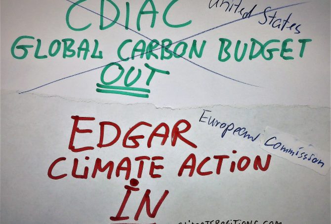
Global Carbon Project (CDIAC), located in the United States, stops publishing carbon emissions data by country – will be replaced by EDGAR in ClimatePositions
2017
The Carbon Dioxide Information Analysis Center (CDIAC), located at the U.S. Department of Energy’s (DOE) Oak Ridge National Laboratory, has published annual Carbon Emissions from Fossil Fuels and cement production by country since 1959 (‘Global Carbon Project‘), but now this continuous time series has come to an end and 2015 will be the last data-year (as it seems).
Since carbon emissions data from CDIAC (Global Carbon Project) is the core ‘Indicator‘ in ClimatePositions’ calculation of Climate Debt, carbon emissions data will be replaced with nearly similar data from ‘EDGAR‘ (‘European Commission‘ / ‘Climate Action‘), retroactively since 1990, in connection with the coming updates [done 16-08-2017].
The following describes the differences between CO2 Emissions data from Global Carbon Project (CDIAC) and EDGAR (sourced: European Commission, Joint Research Centre (JRC)/Netherlands Environmental Assessment Agency (PBL). Emission Database for Global Atmospheric Research (EDGAR)), and the consequences in terms of Climate Debt in ClimatePositions – illustrated with a range of country examples. Note that other sources, such as ‘IEA‘, ‘EIA‘ and ‘BP‘, provides CO2 Emissions data-sets different from the ones of CDIAC and EDGAR.
Climate change performance: 62 countries without Climate Debt (compared to Boycott Group A & B)
2017
Only 62 countries among 159 with full data in ClimatePositions are without Climate Debt (see the ‘Ranking‘). The 62 countries (Group-62) are in alphabetic order: Afghanistan, Azerbaijan, Bangladesh, Benin, Bhutan, Burkina Faso, Burundi, Cambodia, Cameroon, Central African Rep., Chad, Colombia, Comoros, Congo (Brazzaville), Costa Rica, Côte d’Ivoire, Cuba¹, Dem. Rep. Congo, El Salvador, Eritrea, Ethiopia, Gambia, Georgia, Ghana, Guinea, Guinea-Bissau, Haiti, Kenya, Kyrgyzstan, Laos, Latvia, Liberia, Madagascar, Malawi, Mali, Mauritania, Moldova, Mozambique, Namibia, Nepal, Nicaragua, Niger, Nigeria, Pakistan, Paraguay, Philippines, Rwanda, Senegal, Sierra Leone, Singapore, Solomon Islands, Sri Lanka, Sudan, Swaziland, Tajikistan, Tanzania, Timor-Leste, Togo, Uganda, Yemen, Zambia and Zimbabwe.
The table below shows Group-62s combined share of the world’s 1) Population, 2) Forest Cover, 3) Primary Forests, and 4) CO2 Emissions from Fossil Fuels (without bunker) and cement production.
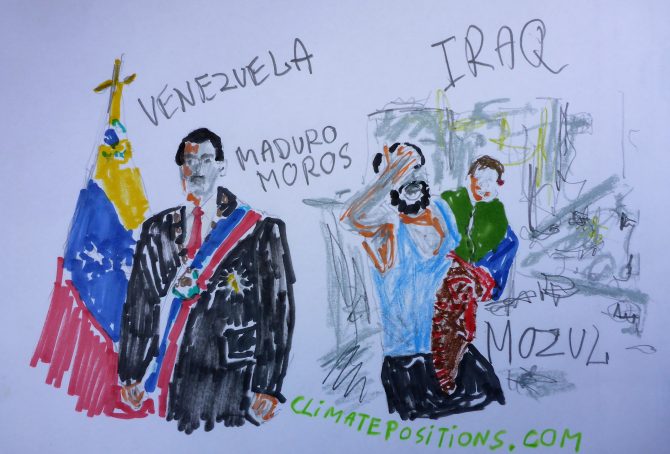
Climate change performance: Venezuela vs. Iraq (world’s proven reserves of oil and natural gas)
2017
Venezuela holds the world’s largest proven oil reserves and the 8th largest proven natural gas reserves, while Iraq ranks 5th on oil and 12th on gas. Together, the two countries hold nearly 27% of the world’s proven reserves of oil and 5% of its natural gas.
The two tables below rank the 15 countries with the largest proven oil and natural gas reserves and their world shares. Combined, the 19 Fossil Fuel countries listed below hold 93% of the world’s proven oil reserves and 88% of the proven natural gas reserves. They represent 38% of the global population, 62% of the global CO2 Emissions from Fossil Fuels (2015) and 74% of the current global Climate Debt in ClimatePositions (the combined share of the global Climate Debt of the 15 countries has increased by 3.6% since 2012; see the ‘Ranking‘.

Climate Change Performance: Vietnam vs. United Arab Emirates (UAE)
2017
The difference in climate change performance of Vietnam and United Arab Emirates (UAE) is somewhat educational. Vietnam’s Climate Debt is $14 per capita, while the authoritarian oil state of UAEs is $10,884 (see the latest ‘Ranking‘). The two countries are the world’s 27th and 28th largest emitters of CO2 from Fossil Fuels (without bunker) and cement – combined, they emitted 0.52 % of the global CO2 in 2015. The following examines the ‘Indicators‘ of CO2 Emissions, Population, GDP(ppp-$) and Forest Cover (including Primary Forest).
First, the diagram below shows the national shares of the global Climate Debt, in 2017 and 2012. Both countries increased their shares in recent years, although at completely different levels and in unalike ways.
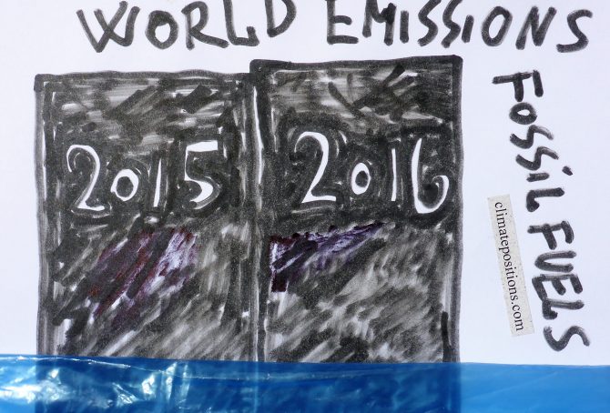
World CO2 Emissions from Fossil Fuels increased by 0.38% in 2016 compared to 2015
2017
According to ‘BP Statistical Review of World Energy June 2017‘ (pdf, page 47), World CO2 Emissions from Fossil Fuels increased by 0.38% in 2016, compared to 2015. The diagram below shows world emissions 2005-2016.
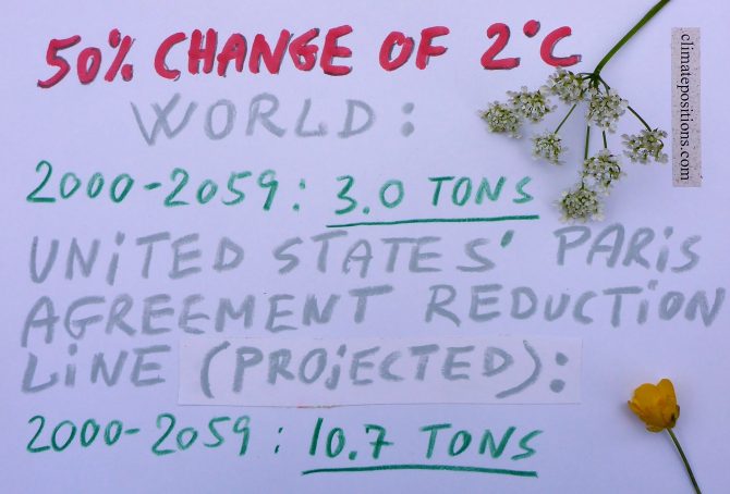
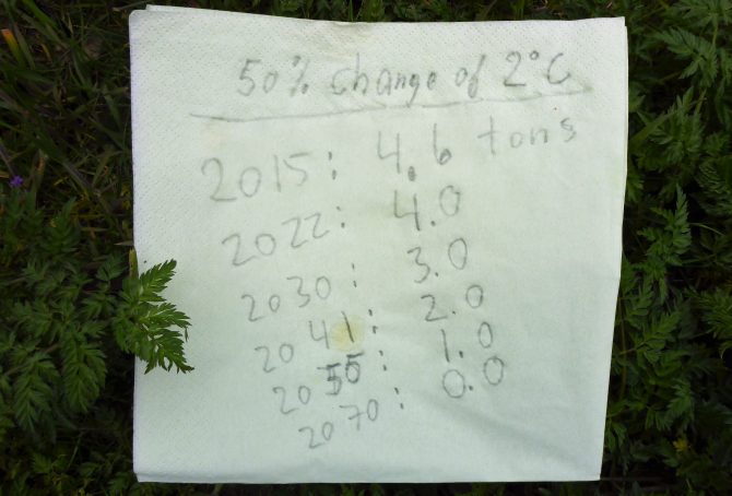
World CO2 Emissions 2000-2059: with 50% risk of 2C global warming (two per capita emission-scenarios for the United States, Denmark, Spain, China, India and Nigeria)
2017
In continuation of the previous article ‘Carbon Brief: Global Carbon Budget and CO2 Emission scenarios (50% risk of 1.5°C, 2.0°C and 3.0°C warming)‘, the following examines the per capita CO2 Emission budget 2000-2059, with a 50% risk of 2°C global warming (which of course is unacceptable). The outcome is then compared with Climate Debt Free CO2 Emission levels (in ClimatePositions) of the United States, Denmark, Spain, China, India and Nigeria, during the same 60-year period. Also, the Paris Agreements reduction commitment of the United States is put into perspective.
Carbon Brief: Global Carbon Budget and CO2 Emission scenarios (50% risk of 1.5C, 2.0C and 3.0C warming)
Based on IPCC’s recent synthesis report, published 2014, ‘Carbon Brief‘ has calculated the number of years we can continue with today’s emission level (and then stop emissions), and still keep global average temperature rise to no more than 1.5°C, 2°C or 3°C above pre-industrial levels – with a 33% risk, a 50% risk, and a 66% risk of failure. One out of nine figures suggest that five more years with the current level of CO2 Emissions (and then total stop) leaves us with a 33% risk of 1.5°C temperature rise.
To frame the overall situation, the first diagram (below) shows three key graphs 1960-2015, with 1960 set at 100: 1) Global CO2 Emissions¹ from Fossil Fuels (without bunker) and cement, 2) Global Population (with projections to 2100), and 3) CO2 Emissions per capita. Even significant reductions of per capita emissions¹, will not necessary compensate for the projected population growth.
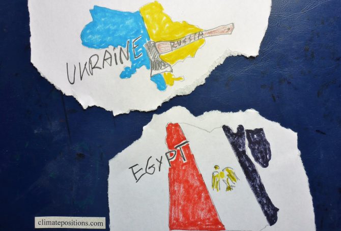
Climate change performance: Egypt vs. Ukraine
Egypt and Ukraine are the world’s 25th and 26th largest emitters of CO2 from Fossil Fuels and cement. Combined, the two countries were responsible for 1.2% of global CO2 Emissions in 2015. The following examines the ‘Indicators‘ of CO2 Emissions, GDP(ppp-$), Ecological Footprint and the Ukrainian Nuclear Power.
The diagrams below show the per capita CO2 Emissions from Fossil Fuel (without bunkers) and cement, since 2000. The green bars show the Free Emission Level¹ – the exceedance is the basis for calculating the national Climate Debt.
World Carbon Emissions from Fossil Fuels and the required reduction line in ClimatePositions (emissions of three country groups by Climate Debt)
If all 97 countries with Climate Debt (see the ‘Ranking‘), had cut national emissions as required in ClimatePositions, then World Carbon Emissions would have dropped significantly as demonstrated in the diagram below. World Carbon Emissions from Fossil Fuels (without bunker¹) and cement amounted a total of 312 GtC (Gigaton Carbon) between 1960 and 2015 … however with the required cuts, emissions would have been 270 GtC, or 14% less … and no countries would have Climate Debt.
Recent analysis² suggest a small 0.2% growth of emission in 2016 compared to 2015 – and that four more years of current emissions “would be enough to blow what’s left of the carbon budget for a good chance of keeping global temperature rise to 1.5C.” Not so smart!

Climate change performance: Malaysia vs. Spain
2017
Malaysia and Spain are the world’s 23rd and 24th largest emitters of CO2 from Fossil Fuels and cement. Combined, the two countries were responsible for 1.4% of world CO2 Emissions in 2015. The following examines the ‘Indicators‘ of CO2 Emissions, GDP(ppp-$), Forest Cover (and Primary Forest) and Environmental Performance.
The diagrams below show the per capita CO2 Emissions from Fossil Fuel (without bunkers) and cement, since 2000. The green bars show the Free Emission Level¹ – the exceedance is the basis for calculating the national Climate Debt. The Spanish reductions are pretty much balanced by the Malaysian increases … which is world symptomatic.
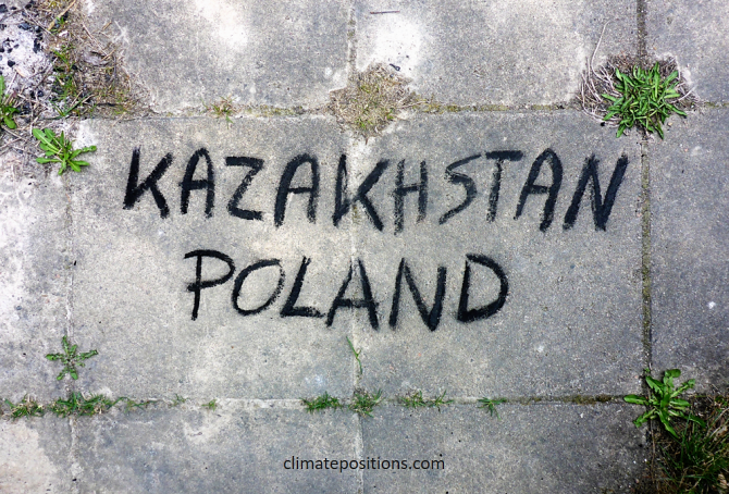
Climate change performance: Kazakhstan vs. Poland
2017
In 2015 Kazakhstan and Poland were the world’s 2nd and 4th largest per capita coal producers. No wonder, the two countries, inhabited by 0.76% of the global population, emitted as much as 1.58% of the CO2 from Fossil Fuels (without bunkers) and cement.
The diagrams below show the per capita CO2 Emissions from Fossil Fuels (without bunkers) and cement, annually since 2000. The green bars show the Free Emission Level¹ – the exceedance is the basis for calculating the national Climate Debt.
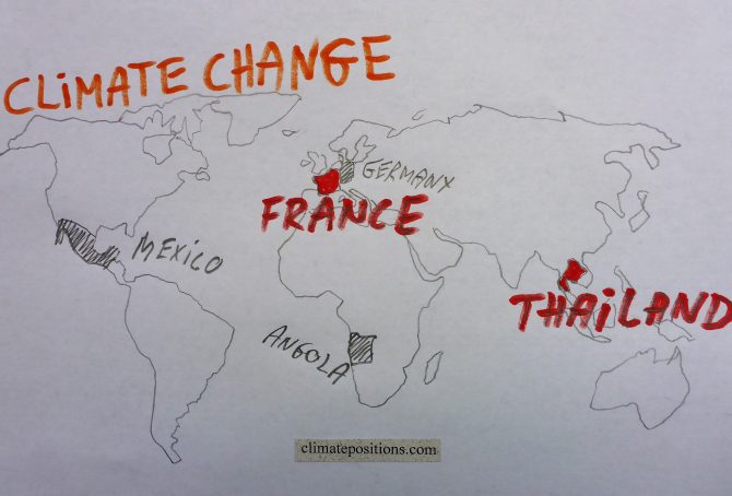
Climate change performance: Thailand vs. France
2017
Thailand and France are the world’s 19th and 20th largest emitters of CO2 from Fossil Fuels and cement. Combined, the two countries were responsible for 1.8% of world CO2 Emissions in 2015. The following examines the ‘Indicators‘ of CO2 Emissions, GDP(ppp-$), Ecological Footprint, Forest Cover and Nuclear Power.
The diagrams below show the per capita CO2 Emissions from Fossil Fuel (without bunkers) and cement, since 2000. The green bars show the Free Emission Level¹ – the exceedance is the basis for calculating the national Climate Debt.
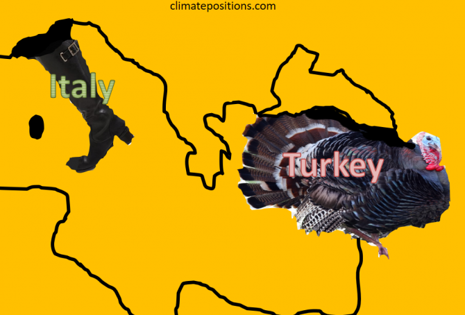
Climate change performance: Turkey vs. Italy
2017
Turkey and Italy are the world’s 17th and 18th largest emitters of CO2 from Fossil Fuels and cement. Combined, the two countries were responsible for 2.0% of world CO2 Emissions in 2015. The following examines the ‘Indicators‘ of CO2 Emissions, GDP(ppp-$) and Forest Cover (including Primary Forest).
The diagrams below show the per capita CO2 Emissions from Fossil Fuel (without bunkers) and cement, since 2000. The green bars show the Free Emission Level¹ – the exceedance is the basis for calculating the national Climate Debt.
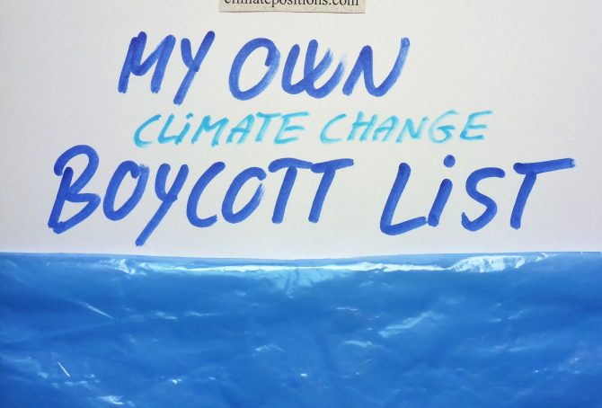
My own climate change boycott country-list
2017
Without been fanatical about it, I seek to boycott the greediest and most climate-destructive countries on the planet. For the fairness, I have divided the fifteen nominees into two leagues:
A) Countries with per capita Climate Debts more than 10 times world average: Qatar, Kuwait, Brunei, Luxembourg, Trinidad and Tobago, United Arab Emirates and Oman.
B) Countries with per capita Climate Debts between 5 and 10 times world average: Saudi Arabia, United States, Bahrain, Australia, Norway, Equatorial Guinea, Canada and South Korea.
Feel free to copy…
Among the fifteen countries only Luxembourg and South Korea are not among the world’s twenty largest per capita Fossil Fuel producers (read the article: ‘How green are the fossil fuel producers? (Correlation between fossil fuel production, CO2 Emissions, GDP and Climate Debt)‘.
The table below shows some key data of the fifteen countries. The table is read like this: 1) Between 1990 and 1999 Qatar emitted 55.1 tons of CO2 from Fossil Fuels (without bunker) and cement, annually per capita, 2) Between 2000 and 2015 Qatar emitted 51.7 tons (the average Climate Debt Free Level¹ was 32.4 tons), and 3) Qatars GDP(ppp) per capita was $143,788 in 2015.
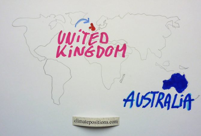
Climate change performance: The United Kingdom vs. Australia
2017
The United Kingdom and Australia and are the world’s 15th and 16th largest emitters of CO2 from Fossil Fuels and cement. Combined, the two countries were responsible for 2.2% of world CO2 Emissions in 2015. The following examines the ‘Indicators’ of CO2 Emissions, GDP(ppp-$) and Ecological Footprint (without carbon footprint).
The diagrams below show the per capita CO2 Emissions from Fossil Fuel (without bunkers) and cement, since 2000. The green bars show the Free Emission Level¹ – the exceedance is the basis for calculating the national Climate Debt.