Global Indicator Update: Land Temperature 2016 (warmest year on record)
2017
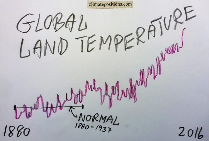
The year 2016 was by far the hottest on planet Earth since measurements began in 1880. Both global Land (air) Temperature and Ocean (air) Temperature were the hottest on record. See the development in Land Temperature between 1960 and 2016 in the diagram below. The average temperature rise 1880-1937 is set at 0°C (baseline 1880-1937) and 2016 was 1.73°C warmer. The development since 1880 in Land Temperature and Ocean Temperature (and the two combined) are available at ‘ncdc.noaa.gov‘.
Added 22-01-17: The Ocean Temperature 2016 was 0.94°C warmer compared to baseline 1880-1937, and Land and Ocean Temperature combined was 1.15°C warmer. Note that other sources may refer to baseline 1881-1910 or even 1951-1980.
Added 07-02-2017: Soon, the global temperature ‘Indicator’ in ClimatePosition will be changed from Land (air) Temperature (10-years average) to Land/Ocean (air) Temperature (10-years average). The change will not affect the current accumulated Climate Debt of any country, only the future calculation.

Global Indicator Updates 2016: Sea Level, Population and CO2 Content in the atmosphere
2017
The estimated annual global Sea Level rise since 1993 increased from 3.3 mm (±0.4 mm) in 2015 to 3.4 mm (±0.4 mm) in 2016. The increase suggests an accelerating rate of Sea Level rise, which is illustrated in the diagram below. The growing volume of the oceans is caused by two effects of global warming: melting ice and warmer oceans. In ClimatePositions the Sea Level rise between 1880 and 1993 is set at 1.2 mm annually, or 14 cm during the 113-year period. The total estimated Sea Level rise between 1880 and 2016 adds up to 21.82 cm and this figure is used as an ‘Indicator‘ in ClimatePositions.
The Sea Level rise between 2004 and 2016 is shown below (Sea Level 1880 and 1993 is set at 0 cm and 14 cm, respectively) – the unscientific polynomial trend line projects the scary tendency by 2100.
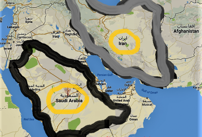
Climate change performance: Iran vs. Saudi Arabia (gas and oil)
2016
The large oil and gas producers Iran and Saudi Arabia are the world´s 7th and 8th largest emitters of CO2 from Fossil Fuels. The diagrams below show the per capita CO2 Emissions from Fossil Fuels (without bunkers) and cement, annually since 2000. The green bars show the Free Emission Level¹ – the exceedance is the basis for calculating the national Climate Debt. Iran and Saudi Arabia were responsible for 1.9% and 1.7% of global emissions in 2015.
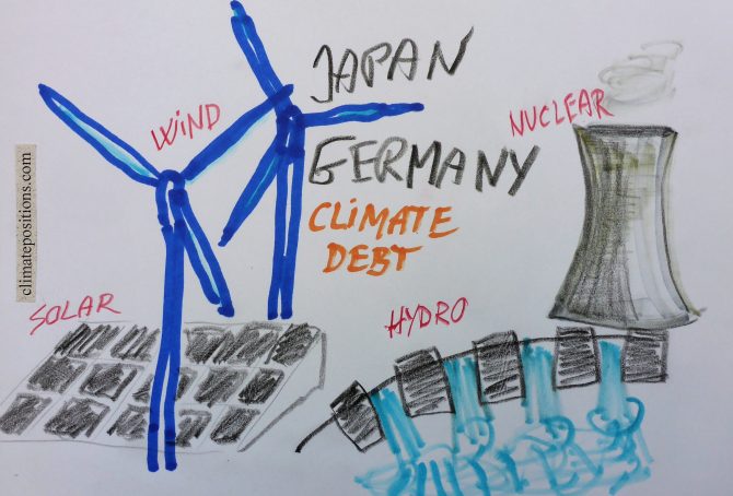
Climate change performance: Japan vs. Germany (Renewable Energy and Nuclear Power)
2016
The world’s 5th and 6th largest emitters of CO2 from Fossil Fuel (without bunkers) and cement Japan and Germany, were responsible for 3.4% and 2.1% of the global emissions in 2015. The diagrams below show the per capita CO2 Emissions, annually since 2000. The green bars show the Free Emission Level¹ – the exceedance is the basis for calculating the national Climate Debt.
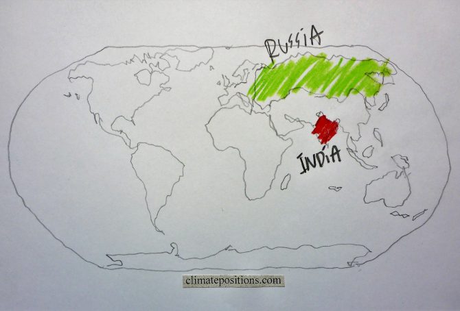
Climate change performance: India vs. Russia (CO2 Emissions from coal)
2016
The diagrams below show the per capita CO2 Emissions from Fossil Fuel (without bunkers) and cement, annually since 2000, of India and Russia. The green bars show the Free Emission Level¹ – the exceedance is the basis for calculating the national Climate Debt. The world’s 3rd and 4th largest CO2-emitters were responsible for 6.5% (India) and 4.9% (Russia) of global emissions in 2015. India’s per capita emissions were 1.7 tons in 2015 (preliminary), which was 4.0% above the 2014-level.

Climate change performance: China vs. the United States (wealth inequality)
2016
The diagrams below show the per capita CO2 Emissions from Fossil Fuel (without bunkers) and cement, annually since 2000, of China and the United States. The green bars show the Free Emission Level¹ – the exceedance is the basis for calculating the national Climate Debt. The world’s two largest CO2-emitters were responsible for 29% (China) and 15% of global emissions in 2015.
Apparently, China’s per capita emissions have peaked, while the moderate reduction-rate 2006-2012 of the United States, has flattened out.

Climate change lawsuit against the government of the United States (Our Children’s Trust)
2016
November 10, 2016, twenty-one youth from the United States, age 9 to 20, were legally permitted to file a landmark constitutional climate change lawsuit against the federal government in the U.S. District Court for the District of Oregon. With support from ‘Our Children’s Trust‘, the youth’s complaint asserts that, through the governments affirmative actions in causing climate change, it has violated the youngest generation’s constitutional rights to life, liberty, property, as well as failed to protect essential public trust resources.

Final Update 2015: new rankings of 159 countries’ Climate Debt, accumulated since 2000
2016
Every five year, since 2005, Final Updates of national Climate Debts are completed in ClimatePositions and 2015-updates¹ are now available in ‘Calculation (Excel)‘. New rankings in six categories, of 159 countries, are available in the menu “Climate Debt”. In the coming months, the climate change performances of selected countries will be analyzed in articles, starting with the United States and China.
The following illustrate Final Update 2015 in two ways: 1) The change of Climate Debt as percentage of the global Climate Debt, annually since 2000, of the 10 largest CO2 emitters, and 2) Key-figures of the United States.
The table below of the 10 largest CO2 emitters (representing 70% of the global emissions in 2015) shows the national shares of the global Climate Debt in 2015 and 2010. China, Russia and Saudi Arabia stand out with extremely harmful developments, while the United States still has by far the largest Climate Debt. See the latest ‘Ranking’ of 159 countries.

Indicator update: Per capita CO2 Emissions 2015, by country (preliminary)
2016
‘Carbon Dioxide Information Analysis Center (CDIAC)‘, or simply Global Carbon Project, has published preliminary¹ national carbon emissions, from Fossil Fuels and cement, in 2015. The total national carbon emissions are converted to per capita carbon dioxide emissions (tons of CO2 Emissions) by multiplying by 3.664 and then divide by Population (sourced ‘World Bank‘).
The table below shows the per capita CO2 Emissions from Fossil Fuels (without bunkers) and cement, in tons, in 2012, 2013, 2014 and 2015 of all 97 countries with Climate Debt in ClimatePositions, after the key indicator update (see the ‘Ranking‘). Updates of 199 countries are available in the menu ‘Calculation (Excel)‘. Note that emissions in 2014 and 2015 are preliminary estimates.

Indicator update: Ecological Footprint (Climate Debt of 15 additional small countries)
2016
The per capita Ecological Footprint¹ for 186 countries has been released for licensing by ‘Global Footprint Network’ (Public Data Package – Free Download). The total national Footprint without the weighty carbon Footprint² is used as an ‘Indicator’ in ClimatePositions. Now 15 additional small countries have full data and thus calculation of Climate Debt for the first time. The per capita Climate Debt of these countries are listed below. Brunei, Luxembourg and Equatorial Guinea enter top-ten of the worst performing countries among the previous 148 countries (see the ‘Ranking’ by January 2016).
Update: GDP(ppp-$) 2015
2016
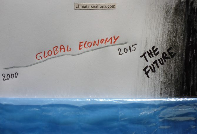
2015-updates of national per capita GDP(ppp-$) from ‘World Bank’ is now available in ‘Calculation (Excel)’. The world’s average per capita GDP(ppp-$) grew from $15,065 in 2014 to $15,470 in 2015 (2.7% growth). In the midst of an unprecedented man-made climate catastrophe and the ‘Sixth mass extinction’ in progress, the human economy keeps growing.
The diagram below shows the development in per capita GDP(ppp-$) 2000-2015 of the world’s five largest emitters of CO2 from Fossil Fuel and cement: China (27.0% of the global emissions), the United States (14.7%), India (7.2%), Russia (4.9%) and Japan (3.4%), in comparison with the world’s average.

The Kigali Agreement: 30-years phase-out plan for Hydrofluorocarbons (HFCs)
2016
Hydrofluorocarbons (HFCs) is a family of factory-made potent greenhouse gases, used as refrigerants in air conditioning systems in vehicles and buildings, and in aerosol propellants, solvents, fire retardants etc. HFCs were developed as replacements for Chlorofluorocarbons (CFCs) and Hydrochlorofluorocarbons (HCFCs), because these gases deplete the ozone layer. The Kigali Agreement announced mid-October, among more than 170 countries, is an extremely complicated amendment to the ozone-shielding Montreal Protocol from 1987.
HFCs, CFCs and HCFCs are all so called Fluorinated gases, or F-gases, and they are released into the atmosphere through leaks, servicing, disposal of equipment etc. The diagram below from ‘NOAA’ shows the atmospheric content since 1978 of four commonly used F-gases.
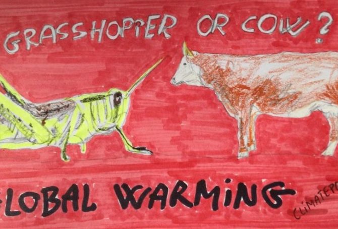
Reduce greenhouse gas emissions: Eat insects instead of meat
2016
The burning of fossil fuels (coal, oil and gas) is the major driving force for global warming¹. However, livestock rearing is responsible for around 18% of the anthropological greenhouse gas emissions (CO2 equivalent) and various edible insects are therefore excellent alternatives to meat in the fight against climate change. It is estimated that insects today is part of the diets of 25-30% of the global population and about 1,900 species are being used as human consumption. The following examine the climate- and environmental impact of different species of insects versus beef, pigs and chicken.

Study: Already developed fossil fuel reserves will potentially take us beyond the 2 degree warming limit
2016
A ‘Study (pdf, 60 pages)’ called “The Sky’s Limit” just released by ‘Oil Change International’ finds that already developed reserves¹ of coal, oil and gas, if extracted and burned, will take us beyond the Paris Agreement’s 2°C warming limit (and of cause far beyond the 1.5°C limit). Developed reserves is defined as currently operating fields and mines (projected to run to the end of their probable lifetimes), wells already drilled, pits that are dug, and pipelines, processing facilities, railways and export terminals already constructed. The developed reserves hold roughly 30% of the fossil fuel reserves.
The study finds that the potential CO2 Emissions from these already developed reserves – if extracted and burned – will exceed the 2°C carbon budget calculated by the Intergovernmental Panel on Climate Change (IPCC). The diagram below is copied from the study.
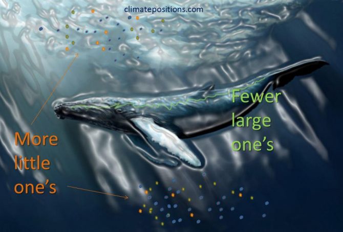
Research: The emerging mass extinction in the ocean threaten larger animals more compared to past mass extinctions (more bad news)
2016
The research ‘Ecological selectivity of the emerging mass extinction in the oceans‘ (pdf, 4 pages), published in the journal Science, show that “extinction threat in the modern oceans is strongly associated with large body size, whereas past extinction events were either nonselective or preferentially removed smaller-bodied taxa.” Or in other words: The balance between smaller animals and larger animals changes to the disadvantage of larger animals – due to human impact.

Report: Explaining Ocean Warming (the greatest hidden challenge of our generation)
2016
‘International Union for Conservation of Nature (IUCN)’ has recently published the report ‘Explaining Ocean Warming (pdf, 460 pages)‘ representing the most comprehensive review to date on ocean warming. IUCN is the world’s largest environmental network, harnessing the knowledge and research of around 1,300 organizations and 16,000 experts. The chapters and sections in the report tells in the scientist’s own words the scale and nature of changes being driven by ocean warming, often in association with other stressors such as ocean acidification and oxygen reductions. The following is an adapted summary of the report’s conclusions and recommendations.
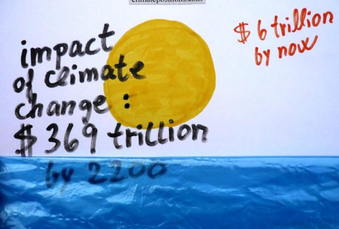
Predicted impact of climate change: $369 trillion by 2200 (study)
2016
Nobody knows how high the costs of global warming will be in the future. However, ‘Studies’ predict a total of $369 trillion by 2200, assuming that humans will have stopped emitting greenhouse gases from burning Fossil Fuels around 2100 and atmospheric CO2 concentrations will have reached 700 ppm. The calculations include accelerating release of methane from melting permafrost (13% of the total costs).
ClimatePositions calculates the ‘Climate Debt’, accumulated since 2000, for 148 countries with full data. The global Climate Debt amounted to $0.8 trillion in 2005, $2.6 trillion in 2010 and around $6.0 trillion in 2015 (preliminary estimate). The diagram below illustrates the accumulated Climate Debts (red dots) “smooth climbing” towards the predicted costs of $369 trillion by 2200 (black dot) … all speculatively of course!
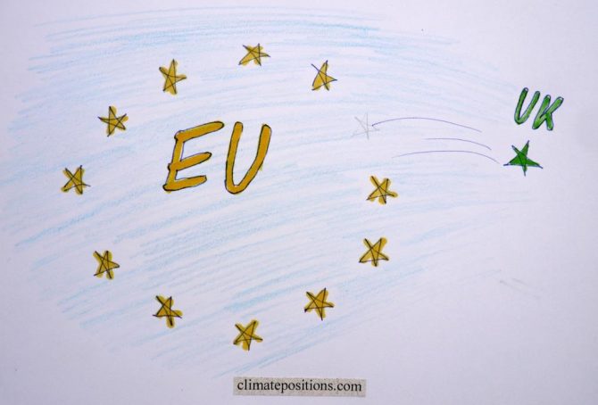
Climate change performance of the United Kingdom in comparison with the European Union
2016
Given that the United Kingdom (UK) has decided to leave the European Union (EU), the following examines the development of CO2 Emissions, Ecological Footprint, GDP(ppp-$) and Climate Debt of the UK in comparison with EU.
Between 1860 and 1890 the UK was the world’s largest greenhouse gas emitter and as late as 1966 the UK was still the 4th largest emitter. See this ‘Interactive timeline of the world’s top 20 emitters‘. When it comes to CO2 Emissions from fossil fuels (without bunker fuels) and cement production the UK was the world’s 15th largest emitter in 2014 (preliminary).
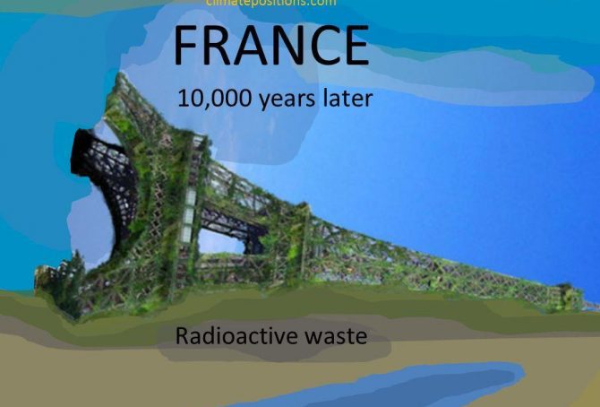
Climate Debt: France ranks 35th among 148 countries
2016
France is responsible for 1.3% of the global Climate Debt of $5.7 trillion, accumulated since 2000. The French per capita Climate Debt by January 2016 was $1,148 which ‘Ranked’ France 35th among 148 countries, compared to 28th in 2010. Different rankings are available in the menu “Climate Debt”. The following examines the CO2 Emissions, Nuclear Power, Environmental Performance, GDP(ppp-$) and Climate Debt of France, in comparison with four countries with significant French-speaking populations: Canada, Belgium, Switzerland and Algeria.
The first diagram shows the French per capita CO2 Emissions from fossil fuels (without bunker fuels) and cement production in decades in comparison with the world average. CO2 Emissions since 2012 are preliminary estimates. From 6.2 tons in the 1990s the level decreased to 5.7 tons on average between 2000 and 2014 (preliminary). The green bars are the Contribution Free Level in ClimatePositions, determined by the level of emissions in the 1990s and a number of continuously updated ‘Indicators’.

Climate Debt: Ireland ranks 14th … however, with significant CO2 reductions over the last decade
2016
Ireland’s current Climate Debt is $2,704 per capita and the ‘Ranking’ by January 2016 was 14th among 148 countries. The following examines the Irish climate change performance in comparison with the United Kingdom, France, Canada and the United States.
The first diagram shows Ireland’s per capita CO2 Emissions from fossil fuels (without bunker fuels) and cement production in decades in comparison with the world average. CO2 Emissions since 2012 are preliminary estimates. From 9.4 tons emitted in the 1990s the level increased to 10.4 tons on average between 2000 and 2009 – and then dropped to 8.0 tons on average between 2010 and 2014 (preliminary). The green bars are the Contribution Free Level in ClimatePositions, determined by the level of emissions in the 1990s and a number of continuously updated ‘Indicators’.