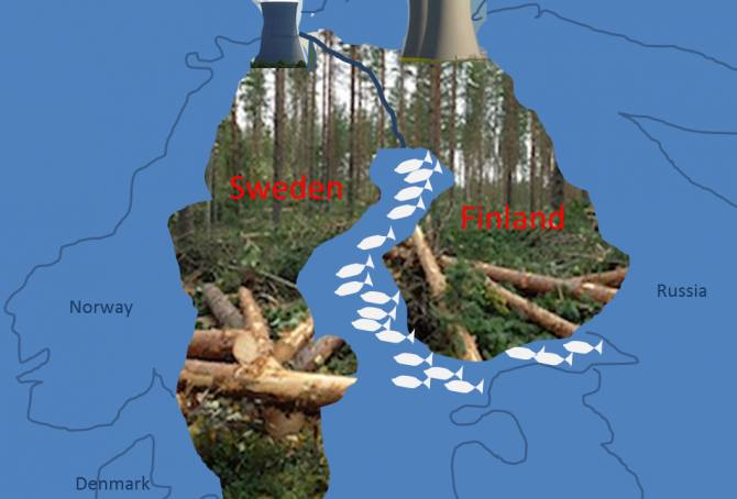
Sweden beats Finland in climate change performance
2015
Finland’s updated Climate Debt is $2,624 per capita and Sweden’s is $1,003. The ‘2014-rankings’ were 18th and 37th among 147 countries. The following examines the indicators of CO2 Emissions from fossil fuels, Nuclear Power, GDP(ppp-$), Climate Debt as a percentage of GDP(ppp-$) and Forest Cover.
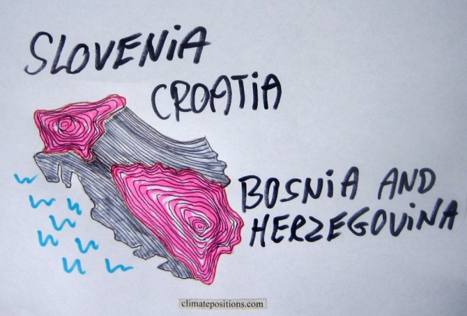
Climate change performance of Slovenia, Croatia and Bosnia and Herzegovina
2015
Slovenia, Croatia and Bosnia and Herzegovina are ranked 26th, 48th and 51st among 147 countries on the Climate Debt List in ClimatePositions (see the ‘ranking’). Their updated Climate Debts are respectively $1,660, $515 and $432 per capita. The following examines the GDP(ppp-$), CO2 Emissions from fossil fuels, Forest Cover, Nuclear Power and Relative Climate Debt over time.
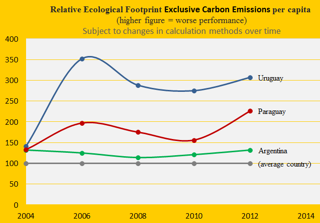
Climate change performance of Uruguay, Paraguay and Argentina
2015
Due to livestock Uruguay has the world’s 2nd largest Ecological Footprint (without carbon emissions) per capita and Paraguay is 5th. Argentina is ranked 37th among 154 countries. The first diagram shows the development since 2004, with the world average set at 100. The footprint is one of several ‘indicators’ in the calculation of Climate Debt in ClimatePositions.
The Climate Debt of Uruguay, accumulated since 2000, is $124 per capita and Paraguay is Contribution Free (no Climate Debt). Due to lack of data of GDP Argentina is excluded from the ranking – however if the GDP(ppp-$) were to be set at the level of Uruguay, then the Argentine Climate Debt would be $405 per capita. The following examines the indicators of CO2 Emissions (carbon dioxide from fossil fuels), Forests, Ecological Footprint and GDP(ppp-$).
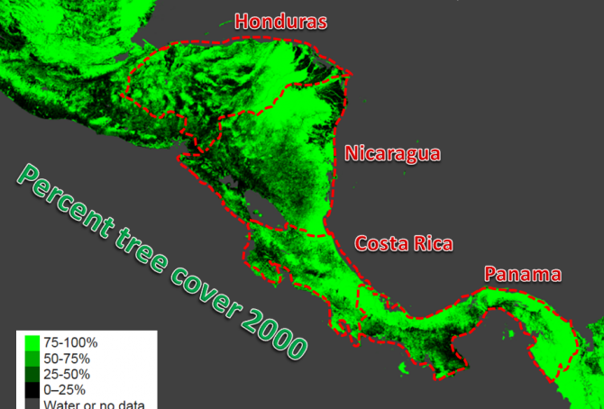
Climate change performance of Panama, Honduras, Costa Rica and Nicaragua
2015
0.32% of the global population lives in Panama, Honduras, Costa Rica or Nicaragua, and together they emitted 0.12% of the global CO2 from fossil fuels in 2012. Panama’s updated Climate Debt per capita is $325 and the Honduran is $18. Costa Rica and Nicaragua are both Contribution Free. See the ‘ranking’ by November 2014. The following examines the indicators of CO2 Emissions (carbon dioxide from fossil fuels), Forests and GDP(ppp-$).
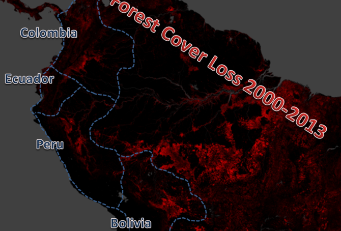
Climate change performance of Ecuador, Bolivia, Colombia and Peru
2015
1.4% of the global population lives in Ecuador, Bolivia, Colombia or Peru, and together they emitted 0.6% of the global CO2 from fossil fuels in 2012. Ecuador’s updated Climate Debt per capita is $84 and Bolivia’s is $18. Colombia and Peru are both Contribution Free. See the ‘ranking’ by November 2014. The following examines the indicators of CO2 Emissions (carbon dioxide from fossil fuels), Forests and GDP(ppp-$).
Greenhouse gas emissions and COP negotiation strategies
2015
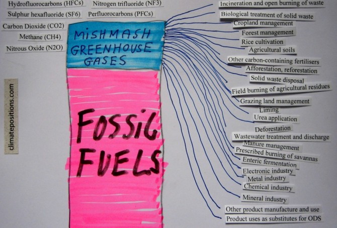
This article is about the different greenhouse gases and what appears to be a delaying COP negotiation strategy on the road to a potentially very costly global greenhouse gas reduction agreement. The essential climate change problem (as I see it) is the greenhouse gas emissions related to fossil fuels. As an example, around 82% of all anthropologic greenhouse gases in the United States are related to coal, oil or natural gas. This measure includes emissions of three different greenhouse gases: carbon dioxide (CO2), methane (CH4) and nitrous oxide (N2O).
Since 1990 the atmospheric concentrations of these three gases has increases by around 13% (carbon dioxide), 7% (methane) and 6% (nitrous oxide). However, the three gases are also emitted from other sources than fossil fuels, including many natural sources … in addition, the potent synthetic fluorinated gases (F-gases) are not related to fossil fuels at all. On a global scale the overall picture is extremely complicated. Note that water vapor is the dominant greenhouse gas among all, but it is not considered relevant to the anthropogenic global warming – and therefore water vapor is usually not regarded as a greenhouse gas.
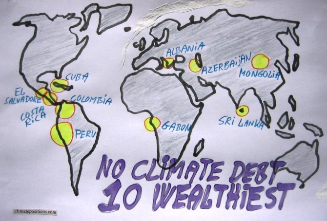
The ten wealthiest countries without any Climate Debt
2015
Among the 147 countries with full data in ClimatePositions 65 are Contribution Free (no Climate Debt). See the ‘ranking’. The table in this article ranks (from 1 to 10) the ten wealthiest Contribution Free countries by the following eight indicators:
- Per capita GDP(ppp-$) (1 = wealthiest)
- Income Equality (1 = most equal)
- Per capita CO2 Emissions from fossil fuels (1 = lowest emissions)
- Democracy Index (1 = most democracy)
- Environmental Performance (1 = best performance)
- Life Expectancy by birth (1 = longest lives)
- Per capita Ecological Footprint without carbon (1 = smallest footprint)
- Primary Forests as a percentage of the total land area (1 = largest percentage)
Read the comments below the table.
Slowdown of Denmark’s accumulating Climate Debt, but..!
2015
Denmark’s updated Climate Debt is $806 per capita. In the latest ‘ranking’ the Scandinavian country is 41st out of 147 countries (where no. 1 is worst) and is often referred to as a green transition pioneer. However, according to various rankings and surveys the picture is somewhat more complicated:
- Denmark’s per capita ‘Ecological Footprint’ – without carbon emissions – is the largest among 152 countries.
- Denmark is ranked 1st among 29 countries (those with data) on organic (ecological) share of all domestic sales¹.
- In the ‘Climate Change Performance Index’ (from Germanwatch and Climate Action Network Europe) Denmark performs best of 58 countries.
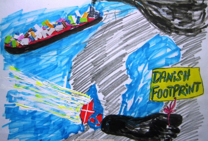
- CO2 Emissions would be around 46% higher than the usual statistics show, if emissions from Danish-controlled overseas ships, sailing goods around the world, were included² (in 2011 the Danish per capita CO2 Emissions would be around 15.0 tons instead of 8.2 tons).
- In addition, Denmark’s CO2 Emissions would be around 18% higher (in 1996-2009), than the usual statistics show, if emissions were consumption-based³ (inclusive CO2 Emissions from the production of imported goods) instead of production-based (inclusive CO2 Emissions from domestic production of goods for export).
However, the following examines only the indicators of CO2 Emissions from fossil fuels (production-based and without emissions from overseas ships), GDP(ppp-$) and Ecological Footprint without carbon emissions.
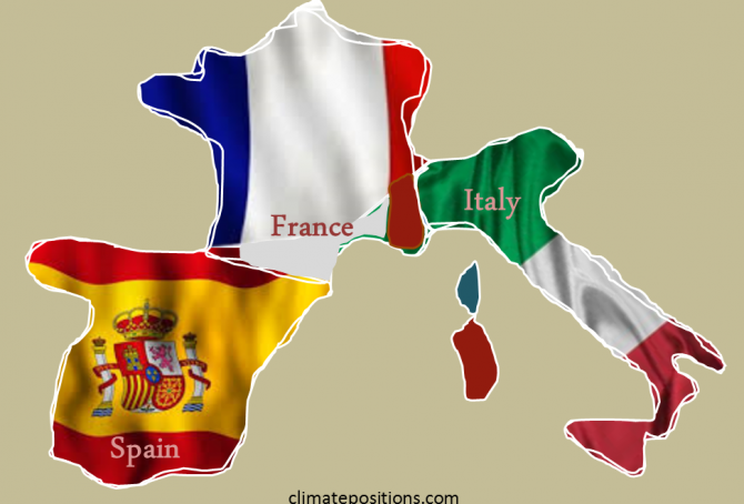
Climate change performance of Spain, France and Italy
2015
2.5% of the global population live in Spain, France or Italy and together they emitted 3.3% of the global CO2 from fossil fuels in 2012 – the combined share of the global Climate Debt is 4.3%. Spain’s updated Climate Debt per capita is $1,692 (ranked 25th), France’s is $1,352 (ranked 31st) and Italy’s is $1,034 (ranked 35th). See the ‘ranking’. The following examines the Climate Debt trends and the indicators of CO2 Emissions (carbon dioxide from fossil fuels), GDP(ppp-$), Forests, Marine Protection and Nuclear Power.
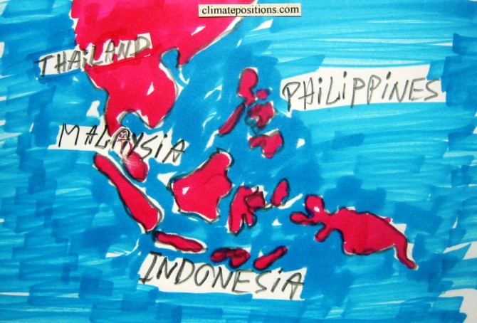
Climate change performance of Malaysia, Thailand, Indonesia and the Philippines
2015
6.4% of the world population lives in Malaysia, Thailand, Indonesia or the Philippines – they emitted 3.2% of the global carbon dioxide from fossil fuels in 2012. The four diagrams below show the emissions per capita 2000-2013 (preliminary estimates of 2013) of the four populous countries of which only the Philippines is Contribution Free (no climate debt) in ClimatePositions. The green bars are the Contribution Free Level of CO2 Emissions calculated from emissions in 1990s and a number of continuously updated ‘indicators’.
Brazil’s rainforests and climate change performance
2014
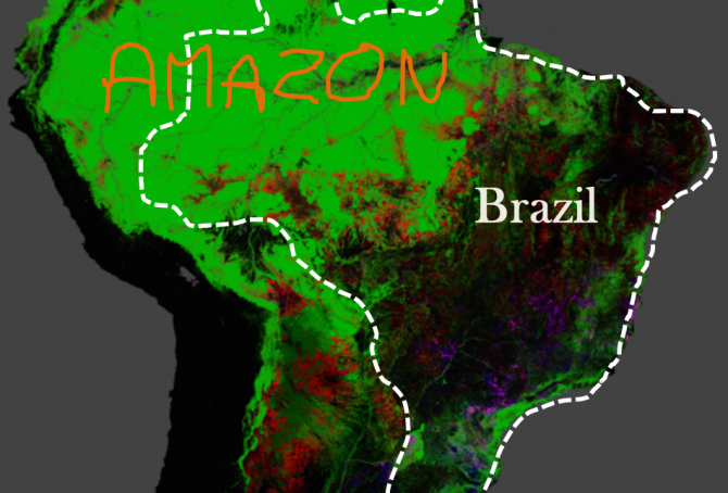
The Google map of the Amazon is from the new interactive ‘Global Forest Change‘ developed by The University of Maryland (read ‘more’). The red is Forest Loss from 2000 to 2012, the blue is Forest Gain and the green is Forest Extent (unchanged). The purple is areas of mixed Forest Loss and Forest Gain. According to Brazil’s environment minister the lowest recorded deforestation of Brazil since 1988, was in 2012. Furthermore, up to a third of the cleared rainforest over the past decades may be on the way back (regrowth).
CO2 Emissions 2013: India is still Contribution Free (but how long?)
2014
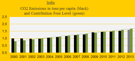
India was the 3rd largest emitter of carbon dioxide in 2013 (preliminary estimate), but the per capita emissions were only about one-third of the world average. The first diagram shows India’s CO2 Emissions per capita 2000-2013 (2013-emissions are preliminary estimates). The green bars are the Contribution Free Level in ClimatePositions. As long as emissions remain below the free level, on average, the climate debt is zero dollars. However, India balances close to the limit.
Ecological Footprint updates 2014 (152 countries)
2014
Recently ‘Living Planet Report 2014’ was released by WWF. In addition to the evaluation of the earth’s ecological condition the report of 180 pages presents a new ranking of 152 countries’ Ecological Footprint per capita (pdf p 157). See the ranking in ‘graphics’. The Ecological Footprint by country is calculated by ‘Global Footprint Network’ (in collaborations with governments in order to improve data and methodology¹).

Invasive species, climate change and mass extinction
2014
There is a lack of standard terminology for invasive species. Some used definitions¹ seem artificially twisted so that Homo sapiens can’t be classified as an invasive species (which of cause is absurd since we are the worst). My own definition used in this article is this: “Invasive species are animals and plants introduced into places out of their natural range of distribution, where they have a tendency to spread and generate a negative impact on the local ecosystem and species.” This clarifies three disputes: a) A species can be invasive and not invasive at different times and different places, b) consequently, not all Homo sapiens are necessarily invasive, and certainly not all the time and c) transportation by plane, ship, train, vehicle, etc. often carry animals (including Homo sapiens) and plants further than their natural range of distribution. This opens up for analyzes.
Forest Cover, Primary Forests and climate debt
2014
The national data of Forest Cover and Primary Forest are both included in the calculations of Climate Contributions (debt) in ClimatePositions. Primary Forest was included as an indicator in the worksheet in August 2014. The following describes selected findings on forests from FAO’s ‘The Global Forest Resources Assessments (FRA), 2010’ (main report, pdf, 378 pages). The Assessment is based on two primary sources of data: 1) ‘country reports’ and 2) remote sensing conducted by FAO and partners.
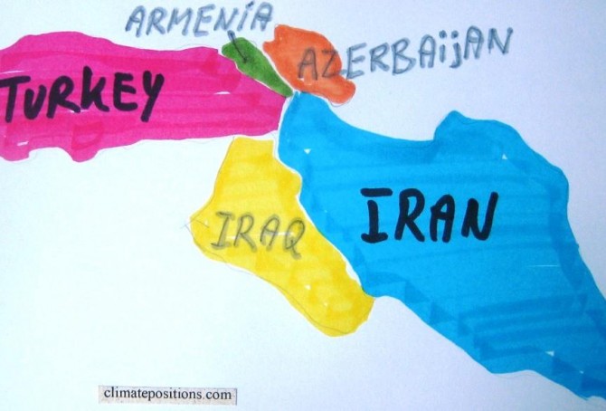
Climate change performance: Iran versus Turkey
2014
The CO2 Emissions of the authoritarian Islamic regime Iran have doubled from 4.0 tons per capita in the 1990s to 8.0 tons in 2011, while the Turkish emissions have increased from 2.5 tons in the 1990s to 3.8 tons in 2011. See the emissions since 2000 in the two diagrams below.
Climate performance of Nigeria and neighboring countries
2014
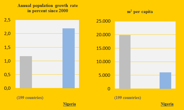
Nigeria and the neighboring countries Benin, Niger, Chad and Cameroon are Contribution Free in ClimatePositions. Nigeria is the world’s 8th most populous country and the annual population growth rate since 2000 is 2.2% or almost twice the world average (see the first diagram). The following examines the indicators of Forest, GDP(ppp), Environmental Performance, Ecological Footprint and CO2 Emissions (carbon dioxide).

Videos about Global Warming
2014
Climate Change science is one thing, but dissemination of quality information through the media is another. Below you will find thirteen selected free videos on various topics related to Global Warming. Film and video make the often technical discussion around Climate Change more accessible and dramatic. If after reviewing the videos you are curious to know which countries are the most resistant to reason, you can see the country ranking ‘here‘.
NOAA Research (Earth System Research Laboratory): “Time history of atmospheric Carbon Dioxide from 800,000 years ago until January 2012”: ‘video 3:35‘.
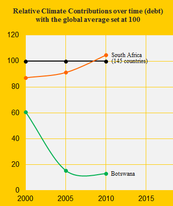
Climate performance: South Africa versus Botswana
2014
South Africa was the 38th worst performing country out of 145 in ClimatePositions 2010 while the neighboring Botswana was the 60th. The Climate Contributions (climate debt) were respectively $448 and $69 per capita (with the latest updates the amounts have increased to $592 and $84 per capita). See the relative Contributions in 2000, 2005 and 2010 in the diagram with the global average set at 100. Below we highlight some of the national indicators in the calculations.
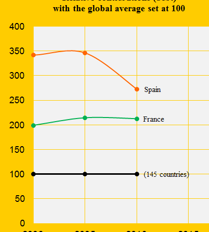
Climate performance: France versus Spain
2013
France was the 26th and Spain the 23rd worst performing country out of 145 in ClimatePositions 2010. As illustrated in the above diagram, the difference in the Contributions (climate debt) has narrowed between 2005 and 2010. Both countries have improved three rankings since 2005. See the full country list in the menu “Contributions/Per Capita US$ Rank”. The following examines the CO2 Emissions, forest area, GDP(ppp-$) and the world’s shares (Population, CO2 Emissions, GDP and Climate Contributions) of the two countries.