Climate Debt worldwide

Forest Cover updates 2015 (and the number of trees on the planet)
2015
The United Nations site for the ‘Millennium Development Goals Indicators’ (MDG Indicators) has published the estimated Forest Cover as percentage of land area of 225 countries. The table at the bottom includes only 83 selected countries with Climate Debt in ClimatePositions (the fraction of the Climate Debt caused by Forest Cover-change is revealed). However, Forest Cover alone is a poor ecosystem-indicator and therefore the area with the precious Primary Forests is also included in ClimatePositions (read the article ‘Forest Cover, Primary Forests and Climate Debt’).
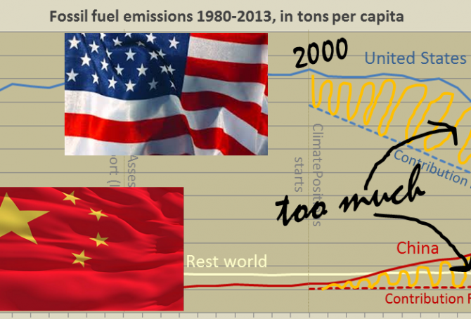
Per capita fossil fuel Carbon Dioxide Emissions: China vs. United States
2015
In different ways, China and the United States are main responsible for the continuing Climate Destruction. Combined the two superpowers, holding 24% of the world population, emitted 43% of the global CO2 from fossil fuels in 2012 and they accounted for 47% of the global Climate Debt¹. Had the two countries consistently promoted a fair and globally binding climate agreement, not thwarted it, then COP21 in Paris in December would not be such an incomprehensible mission impossible². The diagram below shows the per capita fossil fuel carbon dioxide emissions, between 1980 and 2013, of China, the United States and Rest World. The stippled lines indicate the Contribution Free Level of CO2 Emissions in ClimatePositions. More comments below the diagram.
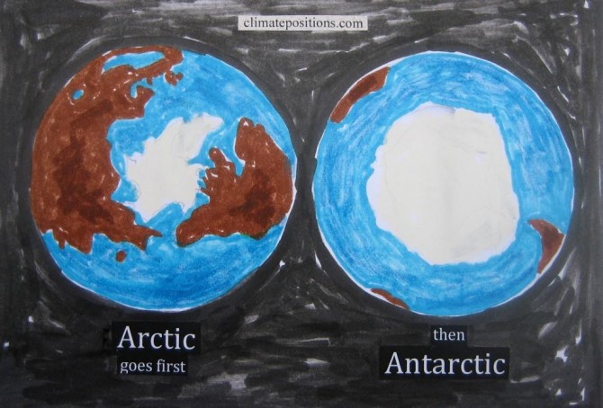
Sea level rises 58 m if all fossil fuels are extracted and burned
2015
A new ’simulation-study from Postdam Institute for Climate Impact Research’ shows that the Antarctic ice sheet would melt, causing the world’s sea level to rise about 58 m, if all the world’s resources of coal, oil and gas are extracted and burned. The following highlight some of the assumptions and outcomes of the study and besides visualize 30 m and 60 m sea level rise in fourteen of the world’s twenty largest cities (Tokyo, New York City, Seoul, Mumbai, Karachi, Osaka, Shanghai, Beijing, Calcutta, Cairo, London, Dhaka, Paris and Rio de Janeiro).
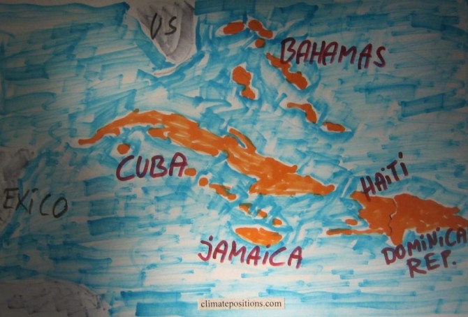
Climate change performance of Jamaica, Cuba, Haiti, the Dominican Republic and the Bahamas
2015
Jamaica’s updated Climate Debt per capita is $181 and the one of the Dominican Republic is $67. Cuba and Haiti are both Contribution Free (no Climate Debt). See the ‘ranking’ of 147 countries by November 2014. The Bahamas are not included due to lack of data on Ecological Footprint – however, if this indicator it is set at world’s average, then the per capita Climate Debt of the Bahamas would be $2,982 (ranked 17). The following examines CO2 Emissions from fossil fuels, GDP(ppp-$), Environmental Performance and Forest Cover.
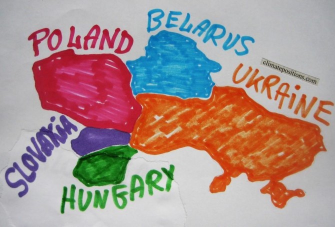
Climate change performance of Slovakia, Poland, Hungary, Belarus and Ukraine
2015
1.5% of the global population lives in Slovakia, Poland, Hungary, Belarus or Ukraine and together they emitted 2.3% of the global CO2 from fossil fuels in 2012 – the joint share of the global Climate Debt was 0.7%.
Slovakia’s accumulated Climate Debt per capita is now $640 (in 2014 the ranking was 43rd among 147 countries), Poland’s is $519 (ranked 47th), Hungary’s is $406 (ranked 54th), Belarus’ is $274 (ranked 59th) and Ukraine’s is $168 (ranked 63rd). See the ‘ranking’. The following examines the Climate Debt trends and the indicators of CO2 Emissions from fossil fuels, GDP(ppp-$) and Climate Debt as a percentage of GDP.
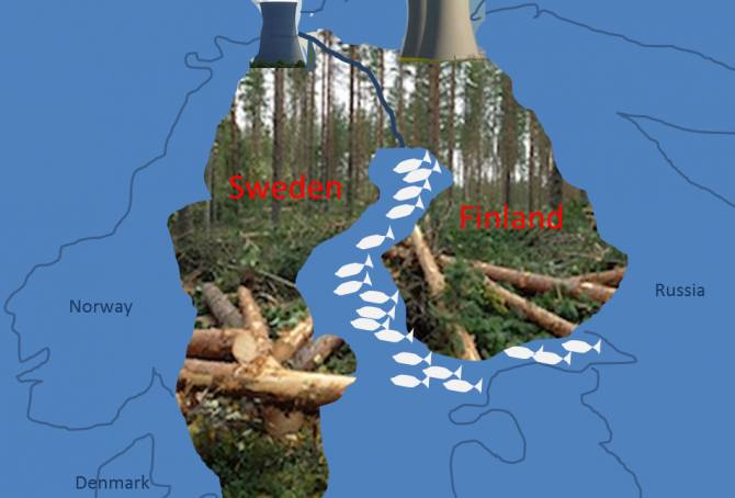
Sweden beats Finland in climate change performance
2015
Finland’s updated Climate Debt is $2,624 per capita and Sweden’s is $1,003. The ‘2014-rankings’ were 18th and 37th among 147 countries. The following examines the indicators of CO2 Emissions from fossil fuels, Nuclear Power, GDP(ppp-$), Climate Debt as a percentage of GDP(ppp-$) and Forest Cover.
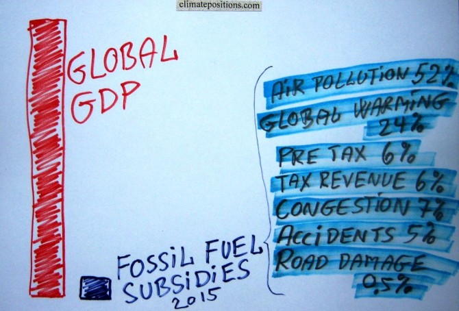
Fossil fuel subsidies: $5.3 trillion in 2015 (IMF survey)
2015
Estimates from the ‘International Monetary Fund’ (IMF) show that fossil fuel subsidies of 155 countries representing 98% of the world’s population, amounted $4.2 trillion (5.8% of global GDP) in 2011 and $4.9 trillion (6.5% of global GDP) in 2013. Projections for 2015 suggest $5.3 trillion (6.5% of global GDP). This huge amount of subsidies is of cause plain stupid.
For comparison, the total ‘Climate Debt of 147 countries‘ in ClimatePositions, accumulated between 2000 and 2013, amounted $5.2 trillion. Roughly speaking, one year of global subsidies equals the total accumulated Climate Debt. Note that global climate change funding is only around $0.14 trillion.
Giving up on future generations is real (about COP Submissions 2015)
2015
COP Submissions with intended national emission targets of 44 countries¹, responsible for 70% of the global CO2 Emissions from fossil fuels, are now available for study. Among the seven largest emitters only India’s submission is still missing. China, the world’s largest emitter, intends to reach its maximum emissions by 2030 (maybe earlier) and then reduce … which leaves global scenarios open to assumptions. The calculations in this article are based on 10% and 30% increase of the Chinese emissions by 2030, compared to 2013.

Climate change performance of Israel, Lebanon and Jordan (refugees from the Syrian Civile War)
2015
The ‘Syrian Civil War’ and other violent conflicts in the region are causing huge numbers of refugees. According to ‘The UN Refugee Agency (UNHCR)’ around 1.2 million refugees lived in Lebanon by December 2014, which was 28% of the usual population. In Jordan, the percentage of refugees was 10% and in Israel 0.5%. For comparison, the world average is about 0.8% (60 million refugees globally). Under these tragic circumstances carbon dioxide emissions and Climate Debt is of cause inconsiderate to discuss, but on the other hand, manmade climate destruction also causes mass refugees, mutilation and death … with increasing force in the coming decades. Experts foresee about 200 million climate refugees by 2050, or about 2% of the projected global population of 10 billion. Or roughly speaking: Two-thirds more refugees, due to climate change alone, in a world with one-third more people – in 35 years.
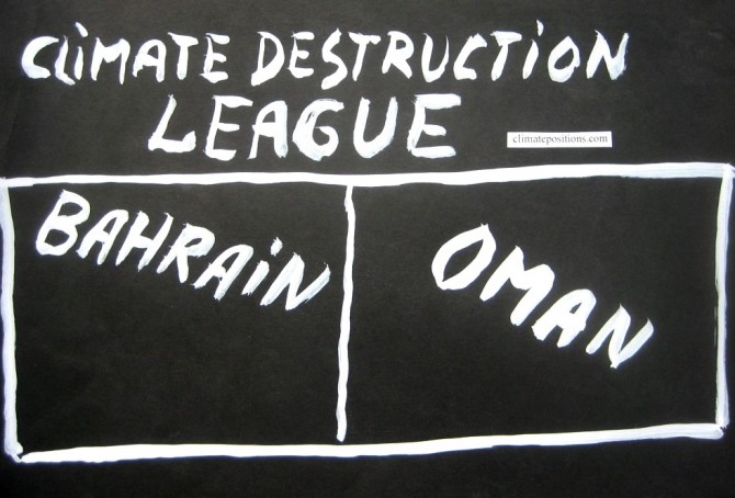
Climate Destruction League: Bahrain vs. Oman
2015
The small authoritarian Islamic oil regimes of Bahrain and Oman are ranked 6th and 8th among 147 countries on the worst performing list (see the ‘ranking’). 0.06% of the global population lives in Bahrain or Oman and together they emitted 0.30% of the global CO2 from fossil fuels in 2012 – their joint share of the global Climate Debt is around 0.66%. Bahrain’s per capita Climate Debt is now $8,668 and Oman’s is $8,077. Renewable energy and global climate change financing are largely non-existent in both countries. Welcome to Climate Destruction League.

Climate change performance of Slovenia, Croatia and Bosnia and Herzegovina
2015
Slovenia, Croatia and Bosnia and Herzegovina are ranked 26th, 48th and 51st among 147 countries on the Climate Debt List in ClimatePositions (see the ‘ranking’). Their updated Climate Debts are respectively $1,660, $515 and $432 per capita. The following examines the GDP(ppp-$), CO2 Emissions from fossil fuels, Forest Cover, Nuclear Power and Relative Climate Debt over time.

Climate change performance of Austria, Czech Republic and Switzerland
2015
0.4% of the global population lives in Austria, Czech Republic or Switzerland and together they emitted 0.6% of the global CO2 from fossil fuels in 2012 – the joint share of the global Climate Debt is 0.7%. Austria’s updated Climate Debt per capita is $2,400 (ranked 19th), Czech Republic’s is $1,137 (ranked 34th) and Switzerland’s is $969 (ranked 38th). See the ‘ranking’. The following examines the Climate Debt trends and the indicators of CO2 Emissions (carbon dioxide from fossil fuels), Nuclear Power, Environmental Performance, GDP(ppp-$) and Climate Debt as a percentage of GDP(ppp-$).

Climate change performance of Libya, Algeria, Tunisia and Morocco (refugees and the European Union)
2015
A devilish combination of poverty, armed conflict and violence in parts of Africa and Middle East, sends flows of refugees in boats across the Mediterranean Sea to Europe via Spain, Italy, Malta and Greece. In 2014 around 150,000 survived the dangerous trip to Italy alone. However, the European Union (EU) offers (as it seems) only a total of 5,000 resettlement places across Europe and the vast majority of all refugees will be sent back as irregular migrants. Read this ‘article’ from The Guardian.
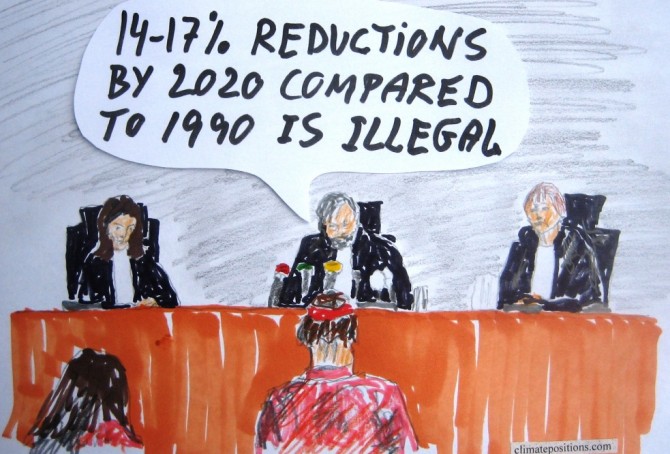
Court has ordered Netherlands to reduce carbon emissions by 25% within five years in the world’s first climate change liability lawsuit
2015
In the first climate change liability lawsuit brought under human rights and tort law, a court in Hague today concluded that the threat posed by global warming was severe and acknowledged by the government of Netherland in international treaties. Therefore the government’s climate policy was ruled illegal and the three judges ordered the government to reduce carbon emissions by at least 25% within five years. Government’s plans to reduce carbon emissions by just 14-17% by 2020 compared to 1990 were rejected as inadequate to protect the citizens from the effects of climate change.
The lawsuit was brought by The Dutch ‘Urgenda’ Foundation. Read the article ‘Dutch government ordered to cut carbon emissions in landmark ruling’ from The Guardian and the article ‘Oslo Principles on obligations to reduce climate change (time for legal sanctions)‘. A similar lawsuit is underway in the neighboring country of Belgium.

Historic use of phrases such as Climate Change, Biodiversity, Renewable Energy, Fracking, etc. (Google Books Ngram Viewer)
2015
‘Ngram Viewer’ is a Google search service showing graphs of historic use of words and phrases in books published in the United States (until 2008). The diagram below shows the trend of the phrases: Climate Change, Biodiversity, Global Warming, Deforestation, Renewable Energy, Greenhouse Effect, Invasive Species and Fracking. The corpus search is in “English” (case-insensitive), between 1980 and 2008. Read the comments below the diagram.

Nuclear Power updates 2014
2015
The world’s Nuclear Power generation increased by 2.2% in 2014 compared to 2013. The six largest nuclear producers United States, France, Russia, South Korea, China and Canada increased generation by 4.0%, while the rest of the world reduced generation by 3.9%.
The same six Nuclear Power countries, representing 28% of the world’s population, are responsible for 54% of the global CO2 Emissions from fossil fuels and 60% of the global Climate Debt (see the ‘ranking’).
The last five years of generated global nuclear electricity was:
Global CO2 Emissions 1990-2013 (three country groups by income)
2015
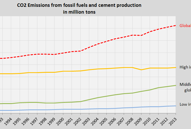
The first diagram shows the global CO2 Emissions from fossil fuels and cement production between 1990 and 2013 (the red dotted line). The trend is of cause outrageous and irresponsible towards future generations.
The other three lines in the diagram show the CO2 Emission trends of three country groups among 147 countries with full data in ClimatePositions, representing 97% of the global population. The three groups are divided by national income per capita in 2012:

Climate change performance of Turkmenistan, Uzbekistan, Kyrgyzstan and Tajikistan
2015
0.7% of the global population lives in Turkmenistan, Uzbekistan, Kyrgyzstan or Tajikistan, and together they emitted 0.6% of the global CO2 from fossil fuels in 2012. Turkmenistan’s updated Climate Debt per capita is $1,394 and Uzbekistan’s is $84. Kyrgyzstan and Tajikistan are both Contribution Free (no Climate Debt). See the ‘ranking’ of 147 countries by November 2014. The following examines the CO2 Emissions (carbon dioxide from fossil fuels), GDP(ppp-$) and Climate Debt as a percentage of GDP.
Climate change performance of Uruguay, Paraguay and Argentina
2015
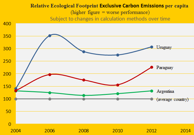
Due to livestock Uruguay has the world’s 2nd largest Ecological Footprint (without carbon emissions) per capita and Paraguay is 5th. Argentina is ranked 37th among 154 countries. The first diagram shows the development since 2004, with the world average set at 100. The footprint is one of several ‘indicators’ in the calculation of Climate Debt in ClimatePositions.
The Climate Debt of Uruguay, accumulated since 2000, is $124 per capita and Paraguay is Contribution Free (no Climate Debt). Due to lack of data of GDP Argentina is excluded from the ranking – however if the GDP(ppp-$) were to be set at the level of Uruguay, then the Argentine Climate Debt would be $405 per capita. The following examines the indicators of CO2 Emissions (carbon dioxide from fossil fuels), Forests, Ecological Footprint and GDP(ppp-$).
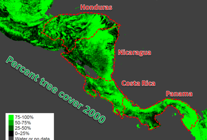
Climate change performance of Panama, Honduras, Costa Rica and Nicaragua
2015
0.32% of the global population lives in Panama, Honduras, Costa Rica or Nicaragua, and together they emitted 0.12% of the global CO2 from fossil fuels in 2012. Panama’s updated Climate Debt per capita is $325 and the Honduran is $18. Costa Rica and Nicaragua are both Contribution Free. See the ‘ranking’ by November 2014. The following examines the indicators of CO2 Emissions (carbon dioxide from fossil fuels), Forests and GDP(ppp-$).
