Carbon Brief: Global Carbon Budget and CO2 Emission scenarios (50% risk of 1.5C, 2.0C and 3.0C warming)
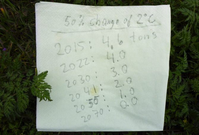
Based on IPCC’s recent synthesis report, published 2014, ‘Carbon Brief‘ has calculated the number of years we can continue with today’s emission level (and then stop emissions), and still keep global average temperature rise to no more than 1.5°C, 2°C or 3°C above pre-industrial levels – with a 33% risk, a 50% risk, and a 66% risk of failure. One out of nine figures suggest that five more years with the current level of CO2 Emissions (and then total stop) leaves us with a 33% risk of 1.5°C temperature rise.
To frame the overall situation, the first diagram (below) shows three key graphs 1960-2015, with 1960 set at 100: 1) Global CO2 Emissions¹ from Fossil Fuels (without bunker) and cement, 2) Global Population (with projections to 2100), and 3) CO2 Emissions per capita. Even significant reductions of per capita emissions¹, will not necessary compensate for the projected population growth.
World Carbon Emissions from Fossil Fuels and the required reduction line in ClimatePositions (emissions of three country groups by Climate Debt)
If all 97 countries with Climate Debt (see the ‘Ranking‘), had cut national emissions as required in ClimatePositions, then World Carbon Emissions would have dropped significantly as demonstrated in the diagram below. World Carbon Emissions from Fossil Fuels (without bunker¹) and cement amounted a total of 312 GtC (Gigaton Carbon) between 1960 and 2015 … however with the required cuts, emissions would have been 270 GtC, or 14% less … and no countries would have Climate Debt.
Recent analysis² suggest a small 0.2% growth of emission in 2016 compared to 2015 – and that four more years of current emissions “would be enough to blow what’s left of the carbon budget for a good chance of keeping global temperature rise to 1.5C.” Not so smart!

Global Indicator Updates 2016: Sea Level, Population and CO2 Content in the atmosphere
2017
The estimated annual global Sea Level rise since 1993 increased from 3.3 mm (±0.4 mm) in 2015 to 3.4 mm (±0.4 mm) in 2016. The increase suggests an accelerating rate of Sea Level rise, which is illustrated in the diagram below. The growing volume of the oceans is caused by two effects of global warming: melting ice and warmer oceans. In ClimatePositions the Sea Level rise between 1880 and 1993 is set at 1.2 mm annually, or 14 cm during the 113-year period. The total estimated Sea Level rise between 1880 and 2016 adds up to 21.82 cm and this figure is used as an ‘Indicator‘ in ClimatePositions.
The Sea Level rise between 2004 and 2016 is shown below (Sea Level 1880 and 1993 is set at 0 cm and 14 cm, respectively) – the unscientific polynomial trend line projects the scary tendency by 2100.
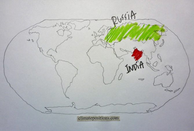
Climate change performance: India vs. Russia (CO2 Emissions from coal)
2016
The diagrams below show the per capita CO2 Emissions from Fossil Fuel (without bunkers) and cement, annually since 2000, of India and Russia. The green bars show the Free Emission Level¹ – the exceedance is the basis for calculating the national Climate Debt. The world’s 3rd and 4th largest CO2-emitters were responsible for 6.5% (India) and 4.9% (Russia) of global emissions in 2015. India’s per capita emissions were 1.7 tons in 2015 (preliminary), which was 4.0% above the 2014-level.

Climate change performance: China vs. the United States (wealth inequality)
2016
The diagrams below show the per capita CO2 Emissions from Fossil Fuel (without bunkers) and cement, annually since 2000, of China and the United States. The green bars show the Free Emission Level¹ – the exceedance is the basis for calculating the national Climate Debt. The world’s two largest CO2-emitters were responsible for 29% (China) and 15% of global emissions in 2015.
Apparently, China’s per capita emissions have peaked, while the moderate reduction-rate 2006-2012 of the United States, has flattened out.

Climate Debt: Bahrain ranks 12th (immigrant workers reduce per capita CO2 Emissions)
Bahrain’s current Climate Debt, accumulated since 2000, is $3,352 per capita. The ‘Ranking’ by January 2016 was 12th among 148 countries. Although the total Bahraini CO2 Emissions from fossil fuels and cement production have increased about 100% since 1990, and 35% since 2006, the per capita emissions have declined from 27.2 tons in the 1990s to 17.9 tons in 2011 – how can that be?
The key explanation is simple: immigration of great numbers of (often) ‘Slavery-like workers‘, presumably with low individual emissions, has lowered the national average! Today around 55% of Bahrain’s population are immigrants from India, Bangladesh, Pakistan, the Philippines, Indonesia, Jordan, Syria, Yemen, Nepal, East Africa etc. If the immigrant-emissions hypothetically is set at 2 tons of CO2 per capita on average (which is more than their origin countries on average), then the 45% native Bahraini’s emitted 38 tons per capita in 2011, or eight times the world average. Nevertheless, the national ‘COP21 Submission 2015’ mentions no overall emission reduction target. Add to this the nasty facts that Bahrain’s fossil fuel production 2012 (Btu) was 44% above the 2000-level¹ and renewable electricity production (Btu) 2012 amounted only 0.003% of the total energy consumption (Btu). Bahrain is categorized as “authoritarian” and ranks 146 among 160 countries in the ‘Democracy Index 2015‘ … and no data is available on income distribution (inequality) – no surprise.
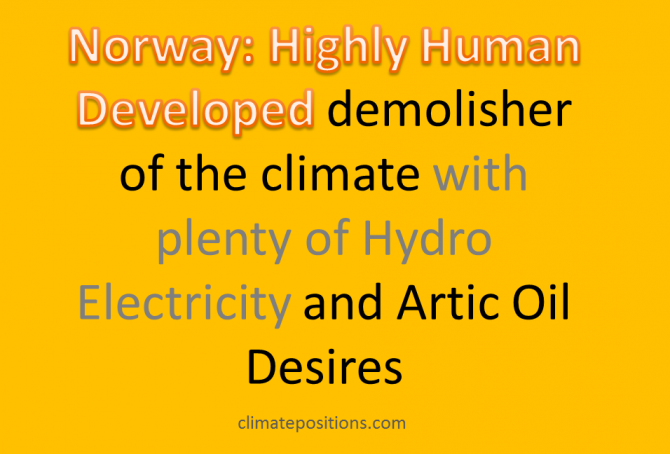
Climate Debt: Norway ranks 9th (performance of top twenty from Human Development Index)
The so called ‘Human Development Index 2015’ (UN) ranks Norway 1st among 188 countries. The index is based on 1) Life expectancy at birth, 2) Expected years of schooling, 3) Mean years of schooling and 4) Gross national income (GNI) per capita. However, the wealthy Scandinavian oil state ‘Ranks‘ 9th among 148 countries on Climate Debt per capita. Norway is in other words a highly human developed demolisher of the climate, one might say! The following examines the climate performance of Norway in comparison with the other top five countries from Human Development Index: Australia, Switzerland, Denmark and Netherland.
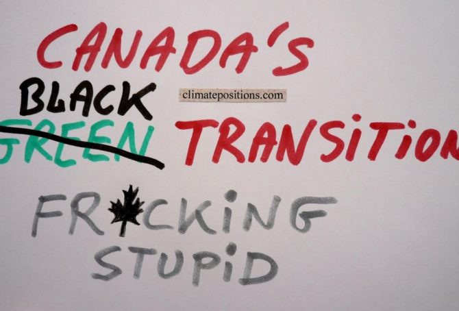
Canada now ranks 10th in Climate Debt per capita (due to black transition)
Canada covers 7.3% of planet’s land area and populates 0.5% of its people. The Climate Debt of the 35 million Canadians amounts to $183 billion, or $5,138 per capita, which ‘Ranks’ Canada 10th among 148 countries. In 2010 the ranking was 7th. The following compares the Canadian performance with the ones of Australia, New Zealand, Sweden and Finland – all wealthy developed countries with small or relatively small population density¹.

Climate Debt: The United Arab Emirates ranks 4th (climate destruction branded by sports!) … soon with Nuclear Power
The per capita Climate Debt of the United Arab Emirates (UAE), accumulated since 2000, is $11,865, which ranks the rich oil-state 4th among 148 countries (see the ‘Ranking‘ by January 2016). Before proceeding, read these ten pinpoints of the intolerable situation:
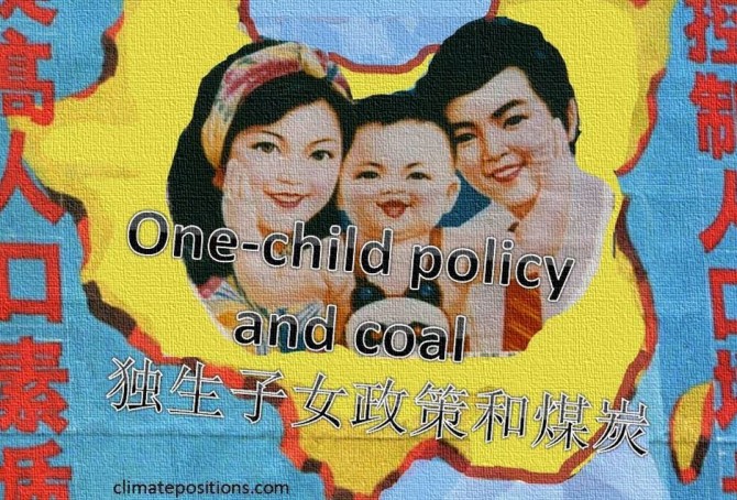
China’s share of the global Climate Debt is growing fast
In 2010 China’s share of the global Climate Debt was 7.4% and by January 2016 it has grown dramatically to 13.3% (see the ‘ranking’). Since 2000 the Chinese share of the growing global CO2 Emissions has grown from 13.7% to about 29.0% (preliminary emissions by 2014). Luckily, the populous superpower has committed itself to pursue “efforts to limit the temperature increase to 1.5 °C” … according to the COP21 Paris Agreement. The following examines the development of CO2 Emissions, Environmental Performance, GDP(ppp-$), Climate Debt and Population (with respect to the one-child policy).

Update 2015: Global Population now 7.35 billion (life expectancy, births rates and an alarming prediction)
The estimated Global Population increased from 7.26 billion in 2014 to 7.35 billion in 2015 – an increase of 1.2%, or 87 million, in one year. See the population growth 1960-2015 in the diagram below. Some surprising demographic trends of life expectancy and births rates, and a long term Global Population prediction, are included.
Per capita fossil fuel Carbon Dioxide Emissions: China vs. United States
2015
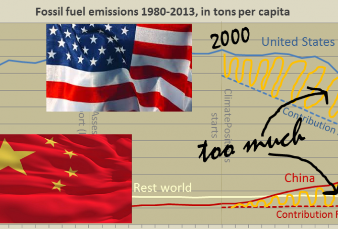
In different ways, China and the United States are main responsible for the continuing Climate Destruction. Combined the two superpowers, holding 24% of the world population, emitted 43% of the global CO2 from fossil fuels in 2012 and they accounted for 47% of the global Climate Debt¹. Had the two countries consistently promoted a fair and globally binding climate agreement, not thwarted it, then COP21 in Paris in December would not be such an incomprehensible mission impossible². The diagram below shows the per capita fossil fuel carbon dioxide emissions, between 1980 and 2013, of China, the United States and Rest World. The stippled lines indicate the Contribution Free Level of CO2 Emissions in ClimatePositions. More comments below the diagram.
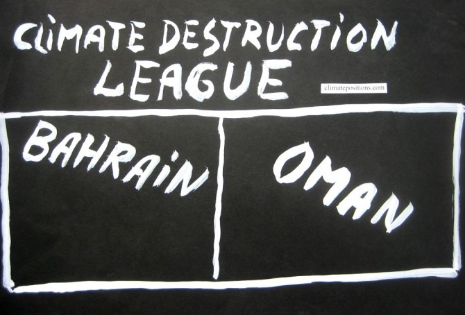
Climate Destruction League: Bahrain vs. Oman
2015
The small authoritarian Islamic oil regimes of Bahrain and Oman are ranked 6th and 8th among 147 countries on the worst performing list (see the ‘ranking’). 0.06% of the global population lives in Bahrain or Oman and together they emitted 0.30% of the global CO2 from fossil fuels in 2012 – their joint share of the global Climate Debt is around 0.66%. Bahrain’s per capita Climate Debt is now $8,668 and Oman’s is $8,077. Renewable energy and global climate change financing are largely non-existent in both countries. Welcome to Climate Destruction League.
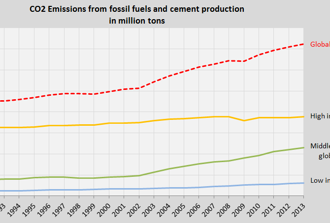
Global CO2 Emissions 1990-2013 (three country groups by income)
2015
The first diagram shows the global CO2 Emissions from fossil fuels and cement production between 1990 and 2013 (the red dotted line). The trend is of cause outrageous and irresponsible towards future generations.
The other three lines in the diagram show the CO2 Emission trends of three country groups among 147 countries with full data in ClimatePositions, representing 97% of the global population. The three groups are divided by national income per capita in 2012:

65 Contribution Free countries…GDP-ranked (with Income Equality, Life Expectancy and Environmental Performance)
2014
65 out of 147 countries with full data in ClimatePositions are Contribution Free (no climate debt). 41% of the world’s population lives in these Contribution Free countries and they emitted only 9% of the global carbon dioxide from fossil fuels in 2012 – without India the corresponding figures are 24% of the global population and 3% of the emissions.
The table below shows the 65 Contribution Free countries ranked by GDP(ppp-$) per capita, with Income Equality (‘Atkinson Index‘), Life Expectancy and Environmental Performance. The world’s average GDP(ppp-$) per capita was $13.791 in 2012. Analysis and comments see below the table – the color codes are explained in the bottom.
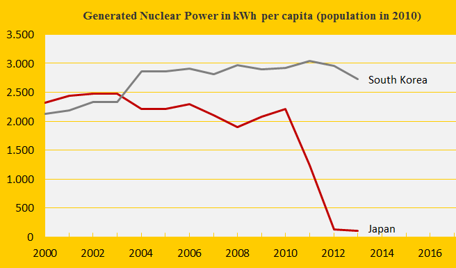
Climate change performance: Japan vs. South Korea
2014
The first diagram shows the nuclear power generation per capita of the two countries. The Fukushima nuclear disaster in Japan in 2011 has caused a remarkable shutdown of generation – while CO2 Emissions from the burning of petroleum, coal and natural gas have increased (from 2011 to 2012 respectively by 6%, 5% and 3%) to close the energy gap. Nuclear power generation produce dangerous radioactive waste to deal with for thousands of future generations (10,000 to 250,000 years) and in ClimatePositions nuclear power is not accepted as a national CO2 Emission reduction instrument (read ‘more’). The following analyzes the indicator trends of Japan and South Korea.
Climate change performance of Russia (compared to other BRICS countries)
2014
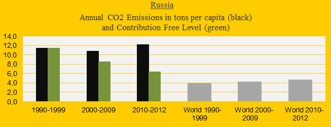
Russia was the 4th largest carbon dioxide emitter in 2012 with 5.6% of the global emissions, after China (26.9%), the United States (16.6%) and India (5.8%). The first diagram shows Russia’s CO2 Emissions per capita in decades in comparison with the world average (the green bars are the Contribution Free Level). After the COP summit in 2009 (at which China and the United States rejected a globally binding reduction agreement) the Russian emissions have increased dramatically and today the Russian Climate Contribution (climate debt) is $1,410 per capita (ranked 28th), compared to $627 in 2010 (ranked 32nd). See the ‘ranking’. The following analyzes the development in Putin’s Russia since 2000 in comparison with the other ‘BRICS‘ countries China, India, Brazil and South Africa – jointly emitting 41% of global carbon dioxide in 2012.
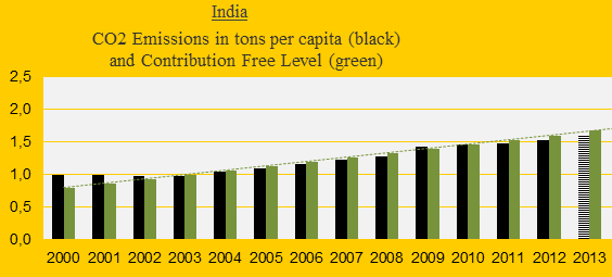
CO2 Emissions 2013: India is still Contribution Free (but how long?)
2014
India was the 3rd largest emitter of carbon dioxide in 2013 (preliminary estimate), but the per capita emissions were only about one-third of the world average. The first diagram shows India’s CO2 Emissions per capita 2000-2013 (2013-emissions are preliminary estimates). The green bars are the Contribution Free Level in ClimatePositions. As long as emissions remain below the free level, on average, the climate debt is zero dollars. However, India balances close to the limit.
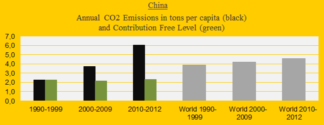
China’s growing climate debt and carbon dioxide emissions is catastrophic
2014
Today, China ‘agreed‘ with the United States (without the Republicans!?) that the Chinese CO2 Emissions can increase by 2030, after which emissions shall decrease. The agreement is legally non-binding and can almost be seen as a confirmation of the ‘worst case climate scenario‘. The first diagram shows the CO2 Emissions of China (the black bars) in decades in comparison with the world average (the grey bars). The green bars show the Chinese Contribution Free Levels in ClimatePositions. Today the Climate Contribution (climate debt) is $402 per capita and the ranking is 52nd out of 147 countries (see the ‘ranking’). The updated Chinese Climate Contribution is 10.3% of the global contribution, second only to the United States (see the ‘ranking’).
Ecological Footprint updates 2014 (152 countries)
2014
Recently ‘Living Planet Report 2014’ was released by WWF. In addition to the evaluation of the earth’s ecological condition the report of 180 pages presents a new ranking of 152 countries’ Ecological Footprint per capita (pdf p 157). See the ranking in ‘graphics’. The Ecological Footprint by country is calculated by ‘Global Footprint Network’ (in collaborations with governments in order to improve data and methodology¹).